a mushtaq

  • Subscribe to our RSS feed.
  • Twitter
  • StumbleUpon
  • Reddit
  • Facebook
  • Digg

Wednesday, 24 April 2013

Bushido:: Exhibition Promotion_Existing

Posted on 05:08 by cena

A worthwhile exercise to look into existing promotion for exhibitions in terms of formats and the kinds of features they all contain, to kind of know the rules so I can create something which kind of breaks them and is fresh and new.


I'm leaning towards TATE Modern, in London as it has the right balance of art and design in terms of Print, Tate Britain seems to have more sculpture and Fine Art. Tate Modern is also the most frequently visited and in central London so it's in a suitable location for the younger demographic I'm targeting.


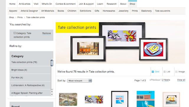
TATE Website

You get a good idea when seeing all the promotional material invovled and the organisation of an exhibition when looking at existing ones - for example one on at the moment is Lichtenstein - A Retrospective. As I'm going to propose a website design it's been helpful to see what kind of information to include


Exhibition information


Booking page, choose time and date, promo codes and different prices for different groups. Admission is free but access to certain exhibitions is at a cost. 


Important exhbition information:
Title of exhibition
Length of exhibition
Price for Adults, concessions and children
Opening times
Book Now
Store links

Important museum information:
About Tate
Getting Here
Access & Facilities
School visits
Contact Us


Related events

Private view

Members' private view: Lichtenstein: A Retrospective
Tuesday 19 February 2013, 10.00 – 17.15
Thursday 21 February 2013, 18.45 – 21.30
Thursday 4 April 2013, 18.45 – 21.30
Wednesday 1 May 2013, 18.45 – 21.30

Courses and workshops

Wham! Print! Pop!
Mondays 25 February – 25 March 2013, 18.45 – 20.45
Architecture: art meets sound with Adjaye Associates
Sunday 28 April 2013, 12.00 – 17.00

Film

Roy Lichtenstein: Three Landscapes
Saturday 9 March – Sunday 24 March 2013
Roy Lichtenstein
Sundays 7 April – 12 May 2013, 12.00 – 13.00
Roy Lichtenstein: Tokyo Brushstrokes and Reflections
Sundays 7 April – 12 May 2013, 14.00 – 15.00

Talks and lectures

Curator’s talk and private view: Lichtenstein
Monday 11 March 2013, 18.30 – 20.30
Lichtenstein Dinner
Thursday 11 April 2013, 18.45 – 22.00
Curator's tour: Lichtenstein
Monday 15 April 2013, 18.30 – 20.30

Conference

Global Pop symposium
Thursday 14, 10.15 – 17:40 and Friday 15 March 2013, 10.30 – 17.45
Lichtenstein and Pop Study Day: Other Worlds of British Pop
Saturday 16 March 2013, 10.30 – 17.30

Daily activities

The Pop Room
Friday 29 March – Sunday 5 May 2013


The Shop


Selling my branding material is a realstic path to take as Tate already sell souvenirs print and merchandise through the online store and when visiting the art shop sells a variety of books and products which would be perfect for exhibition related books, posters and sets.


Visual Outdoor Promotion

Some interesting examples of promotion for exhibitions, events and introspectives I could consider, it helps to know the foundations and recurring characteristics of material by seeing what's already out there.


This rustic and a bit more of a sort of paste-up style is the image I want to go for, for a sort of viral campaign for the exhibition rather than the kind of stuck up, bourgeoise kind of promotion and demographics that art galleries try to attract.


These are all posters communicating an event or exhibition but do it in an interesting and effective, playful way. I'm going to produce work similar to this. I want each poster to be different and unique yet also part of the set. As if a different designer worked on each poster.


All promotional posters above hold information about:

the venue
date
admission
title of exhibition
address


I want my posters to be more cryptic as they need to be quick to digest and inviting you to find out more. So the information I will include is:

Title of exhibition
logo of exhibition
Mention of specific 'virtue' of bushido
Art gallery logo
Length of exhibition. e.g. 21 may - 30 August


////////

I plan on starting working on the posters tomorrow, or the latest by Friday which gives a weekend to solely focus on the posters and make some progress. By the end of next week the posters need to be done hopefully. 


Read More
Posted in OUGD505 | No comments

Bushido:: Visual Style Inspiration

Posted on 04:33 by cena


I'm now going to brand an exhibition aimed at a younger audience to engage with and attend an exhibition to learn more about Japanese and Far Easter history specifically in terms of the idea of a warrior throughout history, culture, media and art.

I will focus more on the branding and I will not propose the exhibition layout and organisation itself, it's almost as if the museum has asked me to brand the exhibition and not work on the exhibition as a space itself.

I'm going to have a much more loose visual style now, as it relates to me and my design aspirations and portfolio and also gives a more cutting edge visual style not associated with this topic of the Far East. I'm inspired by studios such as HORT who have worked with Nike and took a fairly generic topic such as Basketball and turned it on it's head and portrayed so much movement and character and an experimental quality to it. 


I plan on taking notes from this towards the idea of the Samurai. Giving Samurai and Bushido imagery a contemporary and experimental twist, referencing the source material but creating cutting edge design which appeals to the idea of a modern exhibition and the demographic I'm targeting in London.


Can't wait!

Read More
Posted in OUGD505 | No comments

Tuesday, 23 April 2013

Publication:: Binding

Posted on 11:10 by cena
Right now I'm leaning towards this form of binding as it'll be simple to prepare for in terms of print, I won't have to print the leafs and individual papers out in the form of a booklet - which could be a bit of a headache when working with A2 size double page spreads -

I can print off each page individually double sided as you would with a perfect bind and doing this also eradicates the problem of the book functioning and when the book is finished you can flick through the posters

Doing this also allows me to perforate the edge so the user can rip off a poster or page to stick on a wall if they so please which will add a cool touch.


This publication is almost like a minaiture version of what I'm looking to do! I just want a separate booklet binded at the front with the pages at the back also separately usable.


The only issue with this type of bind is you have to account for the binding area in your inner margin and it can get quite tight in the inside margin, especially with a lot of pages so it might get ab it unweidly to use. I'm going to mock it up tomorrow as best as I can so I can crack on with the publication, time is not on my side at the moment.


This is the kind of aesthetic style I want to capture with different sizes and different forms of interactivity, once the binding is nailed down I can play around with the format and scales of individual pages.


Read More
Posted in Level 05 Publication, OUGD501 | No comments

Publication:: Mock-Up 1

Posted on 08:59 by cena

I made a mock-up yesterday to better gauge thei nteraction and format of the publication. In terms of my concept it's very simple, I'm applying fundamental design theory to existing design by recreating the poster in either the European or Japanese graphic design movement of the 50's onwards in the post-war period. Although both are modernist I feel they approached progressive design in a different way and I want to illustrate this.

I've been scratching my head in terms of how to make the use and interaction of the product befit the topic I'm covering, I was inspired by the Tokyo '60 Design Conference. I love the difference in colours, stocks and formats. I really enjoy the way it's all layered and geometric yet also so colourful and playful.


Beautiful design ! The main concept in terms of usability is to reference this and have  the feeling of a variety of different products, formats and stocks somehow bound together to create this sort of scrapbook of visual debate between Europe and Japan. What I'd be referencing is also a very important event in Japanese graphic design history and bridged the gap between the rest of the world.

This is just a mock-up yet and I want to go to town more with the layering of formats and think about the colours and stocks more but I feel this is the best way to go, for my own visual development and for the brief.


With everything opened out on face value the information will be seamless throughout all the individual leafs, everything will line-up for example the title of the publication will run over the booklet and onto the stock underneath it creating an interesting effect.


Book is the first thing you'd read, this is more of the debate side with the layout and purpose of a standard book, I may have tipped in sections and little books within the book, this will be an extension of my essay laid out in a modernist format with facing pages in a separate layout, showing the conflict and agreeing elements between different takes on modernist design.


Once booklet is read you see the posters with a small cover which explains "How would X look if Europe (or a specific European designer) got their hands on it?" and similarly "How would X look if Japan (or a specific Japanese designer) got their hands on it?". The small cover will show the original design and the recreated poster underneath it.


Turning the small cover reveals a quote on the back of it which reinforces the design principles of that designer/movement and the recreated poster reveals itself. 


Turn a poster to see another poster and cover which recreated the same original artwork. 


It's almost as if the book is one product in itself which works as a book and the posters also form a sort of book. There will be a minimum of 6 posters, so at least 3 pieces of design will be recreated both in a European and Japanese design sensibility.


The issue for me at the moment is binding methods, tomorrow I'm going to discuss this with other students and see what they reckon. The issue is how I can bind a book to individual leafs (the posters) and still make the book function and not be tacked down and immobile.


////


I'm going to look into this more and give myself no more than a day to finalise exactly what I'm going to do and how it will be put together in terms of format and binding to find the best solution.


Read More
Posted in Level 05 Publication, OUGD501 | No comments

Saturday, 20 April 2013

Type & Grid: Concertina Booklet: Existing examples

Posted on 07:50 by cena
As a culmination of type & grid sessions with Phil I'm creating a football magazine which is in a concertina fold format as I feel this wil be a refreshing change and brings interesting possibilities in terms of flicking through a page at a time or simply opening it all up to create one big spread with ease.

A good call before starting this is to see what's already out there and the kind of visual style I want to aim for. I want this to be more of a premium supplement, not in terms of price, it'll be more collectable and exclusive to certain stores such as the Village book-store in Leeds. Catering for the consumer interested in experimental and considered layouts with design sensibilities.

Below are examples of football magazines and match programmes I like for various reasons such as scale, colour palette, layout and communication.


The Good

I've highlighted these as I feel these have a much more considered layout than match programmes you might find these days with bold text, less emphasis on the players and more of a class and collectibility about them. The images are more considered and have less emphasis on layering players and sticking drop shadows and outer glows around them

West Brom 68

Arsenal '54-'55


Ajax '75-76


Arsenal '71-72


Arsenal '63-64


One of my favourites! Simple yet so bold. 
You wouldn't see something like this now. Cheeky bit of helvetica
FA Cup '67


City v United '75

Portsmouth v Wolves '39

United v Derby '70


The Bad

Don't mean to sound like a hipster but it seems decent design kind of got lost through the years in terms of match programmes and I definitely wouldn't bother keeping any of these. This is the design style I want to steer away from.


This isn't the aesthetic style I want, won't go anywhere near it. I feel it creates a certain image of football I want to steer away from, it feels and looks cheap and tacky. 


Existing Footy magazines

My magazine will differentiate itself from most magazines out there and market itself towards a specific audience to be more a coffee table magazine, rather than a throw-away magazine as a lot of football magazines are.


FourFourTwo is a stop-gap between cheap football magazines targeted at the younger schoolkid demographic and between high-end glossy coffee table magazines.


All these magazines target a certain demographic and probably are successful in doing so but they create quite a stereotypical, dare I say 'unintelligent' image of football fans with grungey and loud text with overcrowded front covers. Football fans are human like the rest of us and appreciate a nice bit of design too. 

I feel in the past football magazines didn't feel the need to be so loud and the communication was more pure, like here...


Against the norm?

There are a few magazines out there which break the trend and have found success such as Howler magazine a US based glossy which has a highly illustrative and well designed approach to football coverage.


My magazine will most likely be a free supplement available on the stands at select football matches or maybe all. It will be inexpensive to produce and won't hold a vast amount of content but I aim for it to be clean, clear, experimental and a change from the usual stuff you'd receive. And also importantly, collectable.


Read More
Posted in OUGD505 | No comments
Newer Posts Older Posts Home
Subscribe to: Posts (Atom)

Popular Posts

  • TED: Creating Your Logo
    Source:  http://www.ted.com/pages/creating_your_tedx_logo Cool to see what typefaces, spot colours etc organisations use for their logos. //...
  • MEMORABLE ACTION MOVIE/CLOSE SHAVE/INGENIOUS MOMENTS
    As part of the imagery aspect of my brief, I like the idea of adding references to films, through iconography or film stills. I'm trying...
  • Publication:: Presentation Boards
    Modernism_ Japan x Europe Presentation boards for  Monday's group discussion. Topics covered Concept Subject Research Publication Resear...
  • Tokyo World Design Conference _ 1960
    Tokyo World Design  Conference                 1960                            As I'm now still keeping a close eye on the development o...
  • Josef Müller-Brockmann: Principal Of The Swiss School
    Really interesting and articulate overview of JMB's career and the state of Switzerland, Europe and at length the world post-WWII and du...
  • designboom: Massimo Vignelli interview
    massimo vignelli designboom interviewed massimo vignelli on may 21st, 2006 what is the best moment of the day? when I go to bed with a feeli...
  • Lithography In India
    Interesting to read about lithography printing around the world for publications that have nothing to do with contemporary graphic design fo...
  • 100 GREATEST REGGAE SONGS OF ALL TIME
    Source 1.   No Woman, No Cry  -  Bob Marley & the Wailers    2.   Israelites  -  Desmond Dekker & the Aces    3.   Stir It Up  -  Bo...
  • Morihei Ushiba - The Art of Peace
    I've ordered The Art Of Peace by Morihei Ushiba , it's a philosophy book on Bushido and Martial Arts philisophy by a legendary Aiki...
  • Process : Embossing
    As part of my research into basic definitions of different finishing processes I'm now looking into embossing, how it's done and the...

Categories

  • 100 Things
  • Alphabet Soup
  • Collect/Categorise/Communicate
  • Colour Theory
  • Communication Is A Virus
  • Context of practice
  • Cop3
  • Crit Techniques
  • Design For Print
  • Design for Web
  • END OF MODULE EVALUATION
  • Essay notes
  • How To Be A Best Man
  • How To Buy A Diamond Engagement Ring
  • illustrator
  • It's Your Choice
  • Lecture notes
  • Level 05 Essay
  • Level 05 Publication
  • Love/Hate
  • My Red Book
  • OUGD01
  • OUGD401
  • OUGD402
  • OUGD403
  • OUGD404
  • OUGD405
  • OUGD406
  • OUGD501
  • OUGD502
  • OUGD503
  • OUGD504
  • OUGD505
  • OUGD601
  • Personal
  • Photoshop brief
  • Proverb
  • Psychoanalysis
  • Publication
  • Room For Sale Poster
  • Stamp it
  • Study Task 1
  • Study Task 2
  • Study Task 3
  • Study Task 5
  • Task
  • Task 1
  • The Poster Brief
  • THREE
  • Typo-Gateaux
  • Typography
  • What Is A Line

Blog Archive

  • ►  2014 (21)
    • ►  March (1)
    • ►  January (20)
  • ▼  2013 (105)
    • ►  December (8)
    • ►  November (7)
    • ►  October (6)
    • ►  September (30)
    • ►  July (1)
    • ►  June (1)
    • ►  May (13)
    • ▼  April (10)
      • Bushido:: Exhibition Promotion_Existing
      • Bushido:: Visual Style Inspiration
      • Publication:: Binding
      • Publication:: Mock-Up 1
      • Type & Grid: Concertina Booklet: Existing examples
      • Publication Proposal & Feedback
      • Publication:: Presentation Boards
      • Publication:: Dieter Ram's 10 Principles
      • Publication:: Notes on Gary Hustwit's Helvetica
      • Essay Feedback - Plan of Action
    • ►  March (5)
    • ►  February (20)
    • ►  January (4)
  • ►  2012 (228)
    • ►  December (18)
    • ►  November (41)
    • ►  October (23)
    • ►  September (1)
    • ►  May (38)
    • ►  April (18)
    • ►  March (45)
    • ►  February (23)
    • ►  January (21)
  • ►  2011 (83)
    • ►  December (18)
    • ►  November (37)
    • ►  October (19)
    • ►  September (9)
Powered by Blogger.

About Me

cena
View my complete profile