


Cool to see what typefaces, spot colours etc organisations use for their logos.
//
We've created a unified system for TEDx logos, so they all retain the same look and feel. We provide two different templates you can download and customize for your event. Each includes a text field for you to type in your event name (in Helvetica) so it automatically appears in the correct place. (For events with longer names, there is a template that puts the name of your event on a second line.)
One- or two-line tagline
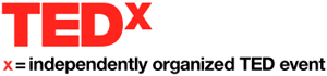
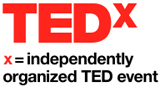
The TEDx logo is unique artwork that has been created to brand and market all TEDx events. TEDx has an official tagline that is in a lockup relationship with TEDx: "x = independently organized TED event" must be included in the logo, either as one line or two lines. (Do not change the wording of the tagline -- the only approved versions are shown here.)
The one-line tagline logo is preferable. However in situations where there is not enough room to use a logo of this width, the two-line tagline logo may be used.
Logos and place names
Your specific TEDx logo will contain the place name. For longer place names, there is an alternative template that puts the place name on a second line.
Place names with descenders
For place names that contain lower-case letters with descenders (p, q, g, j, y) use the two-line stacked tagline so that the descenders do not touch the tagline.
TED color
- Offset printing with Pantone inks: When possible, a spot color should be used for your logo -- this is the best way to reproduce TED red (Pantone 485).
- Offset printing with 4-color process inks: If specifying a spot color is not possible, the 4-color process (CMYK) method of printing may be used to print your TEDx event's logo. 4-color process printing is acceptable, although it is not the preferable way to reproduce our logo. In 4-color process printing the TED red color will only be simulated.
- Note that even though you may be offset printing a publication using 4-color process, it is often possible (and highly recommended) to specify an additional spot color (Pantone 485) for the logo.
- Desktop printing: Sometimes it is more appropriate to produce branded publications and other communications using a digital process -- such as printing from a computer directly to a desktop laser or ink-jet printer. Local settings and calibrations should be used to determine the best color specifications for your particular printer.
- On-screen/web: When your TEDx event's logo is reproduced on-screen in Microsoft PowerPoint presentations, in video, or online for the web, RGB or web color logos should be used. On-screen applications use RGB (red/green/blue) values to simulate color. On the web, hex values are used to specify color. Each of these specifications is shown above-right.

The colors shown here and throughout these guidelines have not been evaluated by Pantone Inc. for accuracy and may not match the Pantone Color Standards.
Due to the manner in which color is represented on-screen, the colors shown here may not accurately represent the true TEDx colors. Therefore, do not use the colors shown here (or a printed version of this page) for color matching. Instead, always refer to the color specifications and visually match the specified colors accurately using Pantone Color Standards.
Specifications / templates
We've created a unified system for TEDx logos, so they all retain the same look and feel. We provide two differenttemplates that you can download and customize for your event. Each includes a text field for you to type in your event name (in Helvetica) so it automatically appears in the correct place. (For events with longer names, there is a template that puts the name of your event on a second line.)
- Typeface: The typeface (Helvetica) is an integral part of our visual identity and should not be changed or substituted. Helvetica comes pre-installed on most computers, but if you do not have access to it, use Arial. If you have a different version of Helvetica (Helvetica Neue, for example) use the Regular weight of your version.
- Kerning: Letter-spacing in the TEDx logo templates is set to 0. Do not adjust this setting.
- Alignment: The name of your event should always align left in relation to the "TEDx" part of the logo, and should be sized to be exactly the same height as the "TEDx" part of the logo. Letter-spacing in the TEDx logo templates is set to 0. Do not adjust this setting.
- Color: your TEDx event's logo should always include a red "TEDx", and either black or white text for the other words. Use a solid, all-white or all-black background. (For your event's profile on TED.com, we recommend a white background.) Do not place your TEDx event's logo on other colors or on photographic, patterned or illustrative backgrounds.
Background color
Use a solid, all-white or all-black background, as shown at right. (For your event's profile on TED.com, we recommend a white background.) Do not place your TEDx event's logo on other colors or on photographic, patterned or illustrative backgrounds.
Clear space
To remain completely legible and ensure that your TEDx event's logo is presented in the best possible manner, a minimum buffer zone of clear space should always be maintained around the entire perimeter of the logo. Other logos, graphics or copy must be kept out of this zone. (Logos may not be "locked up" with any other logos or images. Other logos cannot appear as if they are a part of your TEDx event's logo.)
Minimum size
Proportions must stay consistent when your logo is resized. To ensure legibility, never use your TEDx event's logo with an overall width that is less than 2.0 inches. At widths that are smaller than 2.0 inches, the tagline will become illegible.
What to avoid
Do not set the place name in all caps, or change its size.
Do not change the color of TEDx, the place name, or the "x" in the tagline.
Only use the 2-line template for longer place names. Do not change the color of the "x" in TEDx.
Do not create your TEDx event's logo or the TEDx tagline in your own typeface.


0 comments:
Post a Comment