Saturday, 29 October 2011
Friday, 28 October 2011
LECTURE 3 - GRAFFITI/STREET ART
Posted on 08:06 by cena
20th/21st century graffiti
Caves at Lascaux, France
-Drawings and paintings on a cave walls from the Paleothilic peliod
-Everyday things, hunting, livestock etc
-Wasn't an act of "rebellion", more sort of communal
-Scratched with animal bones, natural pigments
Ancient Rome Graffiti
- From Pompeii graffiti on wall
- Was destroyed in 79AD by Mount Vesuvius, "vandal graffiti" like how nowadays they do woz ere
Caricature of a politician
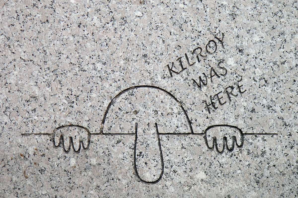
Kilroy Was here -> WWII memorial in DC
UK slogan "wot no..." making light on shortage of food.
PARIS, MAY '68
We are the power -> nouse sommes le pouvior
Civin unrest inspiring cultural/creative material. movement of DIY posters, book published by Marc Rohan Paris '68
URBAN GRAFFITI
1970's New York
->evolves alongside hip hop culture - saying "we will not be ignored"
->State of New York, "the big apple", the rebrand
JON NAAR, PHOTOGRAPHER, 1973
Kind of sympathetic, Doesn't document in judgemental way but more of a fly on the wall way. Quote from "becoming a graffiti photographer" - John Naar
..."were a cry to change the ghetto."
*Jean-Michel Basquiat - 60's
SAME - SAME-OH
was shortened from 'same old shit'
while students, Basquiat+Diaz started to put up the first SAMO (c) graffiti in Manhattan. Ironic use of the (c) symbol. Classing is as "art"/ownership.
"a pin drops like a pungent odor"
1979 - SAMO IS 'DEAD'
NEO EXPRESSIONIST PAINTING
Basquiat moved style to paintings - "untitled 1982"
Dated Madonna for a while
Died of a heroine overdose at age 27
WARHOL+BASQUIAT
-General Electric with waiter, 1984 > critique of capitalism
Warhol collab'd with Basquiat in later life
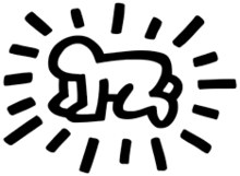
KEITH HARING, RADIANT BABY 1990
-use of bright colour
-thick outlines
In 1981, sketched chalk on black paper and painted plastic, metal and found objects
1984, Listed DZ and painted murals in melbourne
adding black and white ad design ON TOP of advert seamlessly
POPSHOP
Selling t-shirts, toys, posters, bearing his signature images
celebrity hangout
"breaking down barriers between high and low art" - Keith Haring
*John Fekner, Broken Promises, 1980
-stencilled phrases on disused buildings
-referring to shortages and difficulties at the time
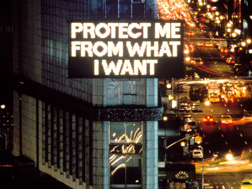
*Jenny Holzer, Time Square Show, 1980
LCD in times square
"abuse of power comes as no surprise" political, wanting to be heard?
VIDEO GAME CULTURE
-Berlin Wall
-Comments on lack of availability of brands+tech in the Eastern Block
TATS CRU, 1997 for Coca Cola
-Devaluing effect on graffiti, not being used in the way it was orginnaly intended to be used. Now used commercially and for the 'big evil brands'
BOMB THE WORLD (2004) PS2
JET SET RADIO
freedom of expression outlawed in Tokyo
TAGGING IN GTA:SA
*INVADER
-french artist, born 1969
-first mosaic in mid 90's Paris
-Mosaic >more permanency, weatherproof and difficult to remove.
pixil like
the 'invasion' spreads first across France and then 22 countries worldwide
Conceptual elements. Points on a map form a Space Invader. Inviting you to come and look at the work physically, looking through the city kinda as his characters.
STREET ART
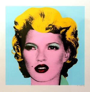
Banksy - kate moss
Shepard Fairey
Moving from walls to art galleries
Parisian Photographer JR.
Favela
Enlarged photographs on side of houses
-women
drawing attention to women, feel they're underepresented
Blu (Italy) and Os Gemeos (brazil)
Lisbon 2001
The building becomes the drawing
almost 3D
3 turrets at the top of the building help make the crown
logos of corporations, like Shell, Esso, etc.
Corsa Ad 2011
Graffiti crawling all over building
city taken over by graffiti
by Loomit and Daim
http://www.youtube.com/watch?v=5IYRysBNpoQ
123 KLAN
-Founded as graffiti crew in 1989 by Scien and Klor, turned hands to illustration and design. Clients such as Stussy
PAUL CURTIS (MOOSE)
REVERSE GRAFFITI
symbolic of cleansing, removing the dirt
limited life, will wash away
environmental approach to graffiti
SAM 3 Spain Murcia 2010
-only uses black paint
environmental message
VHILS aka Alexandre Forto (portugal) London 2008
sculptural approach to graffiti
clipped away plaster on the wall to create a portrait
FAITH 71
amsterdam
red stickers natural hole in plaster
bridges the gap between hyperrealist art and hyperabstract art
DIVA (brooklyn)
Fema
pseudonym doesn't mean you're identified as male/female
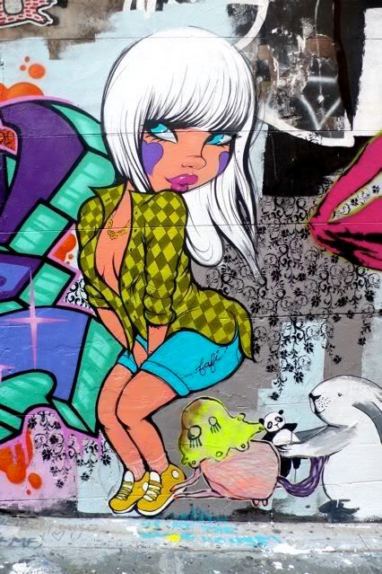
FAFI (france)
-one or more well known, female graffiti artists
-cartoon style, generally oversexualised
Miss Van
Over sexualised, looks like girl out of Roger Rabbit
HeraKut
More photoreal, realistic type of graffiti
Banksy - Palestine
STYLE WARS 1983 FILM. HIP HOP CULTURE MADE IN NYC
Tuesday, 25 October 2011
Lecture 2: Postmodernism
Posted on 15:54 by cena
-Mixes serious with jokey. Sort of satirical look.
MODERNISM
-Born out of optimism, aftermath of WWI
New technology e.g. steel, photography etc.
View to harnessing tech to improve peoples lives
Le Corbusier, Villa Savoye, Poissy, 1928-9
FORM FOLLOWS FUNCTION
Associated with:
- experimentation
- innovation
- individualism
- progressed
- purity - lack of narattive. e.g. Pollocks paintings
- originality
- seriousness
...Post modernism is generally the opposite of this.
Post modernism characterised by:
- exhaustion
- pluralism
- pessimism
- disillusionment with the idea of absolute knowledge
Some overlap
Modernism - expression of modern life/technology/new materials/communication/modernity
Post modernism - reaction to..all of the above
Jean Tinguely - 'Homeage to New York'
MDMA - Museum of Modern Art
- Made sculpture right outside entrance. Made of rubbish, like a machine, smoke spits out and it blows itself up. Self destructing and temporary art. Piece of art almost against the idea of art and it being timeless. Technology is flawed, is maybe what it's saying.
ORIGINS OF PM
1917 - German writer Rudolph Pannwitz. spoke of 'nihilistic, amoral postmodernist time'
1960s - Beginnings
1970s - Established as terms (Jencks)
1980s - Recognisable style
80's/90s - Dominant theoretical discourse
Today - Tired
USES OF THE TERM POSTMODERNISM
-After modernism
-The historical era following the modern
-Contra modernism
-Equivalent to 'late capitalism' (Jameson)
-Artistic and stylistic eclectism - sentiment that reminds you of PM
-"global village' phenomena - globalisation
15 July 1972 3:23pm - Modernism dies according to Charles Jencks (Language of Postmodernism Architectue 1977)
Built something to save the world and then thought fuck it. - The demolition of the Pruit Igoe development in St, Louis. Housing projects, a modernist view. Taken down as it led to crime etc. "projects' is a hip hop term and part of the hip hop culture.
Became like slums, crime, drugs, vandalism. Didn't feel like they belonged to the environment. Lack of individualism and personalness with work.
Le Corbusier "Plan Voisin 1927"
-Plan for perfect city - different with people and dirt. Something maybe not foreseen.
Living in a neat and perfect house, reduces human to something regulated by the house and not the other way round. Bauhaus architecure.
UTOPIA + TECHNOLOGICAL DETERMINISM
POSTMODERNISM
A reaction to these rules->
FUNCTION BEFORE FORM -> vice versa?
-starts as critique of international style
-Robert Venturi -> Learning from Las Vegas, 1972
-Ideas developed
1957- Mies Van Der Rohe + Phillip Johnson
-Seagram building, New York 1957
-Ambition of international style architecture
Still there now. Extravagant materials. Cheaper materials used, crumbles.
1960 - Park Hill flats, Sheffield 1960
Mass social housing
crumbles.
Looks grim, erods, falling apart
unpopular development
problems with crime -> underclass shoved in housing and buildings
cold, soulless
Cant be knocked down as it's a Grade 2 building
Park hill had abit of a post modernist makeover
Proposed regeneration by Urban Splash
Didn't happen cleaned up abit and coloured it up abit.
Epitomised everything wrong with Modernism, ignored peoples needs over design principles.
React to MODERNISM, trying to MINIMALISE IT.
AT+T Building, Phillip Johnson NYC 1982-
Humanised looking skyscraper, top of t looks 'comfy', top shaped like a familiar house.
Serious, but at the same time, a reaction and abit different and odd. Bit more of a lighthearted exterior.
Frang gehry - Guggenheeim - Bilbao 1997
Definitely not function before form.
Supposed to be 'fun', not 'austere' sticking to rules
->James Stirling, Neue Staats Galerie, Germany 1977-1987
Literally made to look like holes in it, references to classical architecture. Modernism never looked back, yet in PM there's no rules now!
"is somebody proposing to dive from this tower?" Prince Charles 1984. Not a fan of PostM.
"leeds style of architecture" - References bricks of modernism in some leeds buildings, Own collee, LCA, has the same references.
Postmodernism is trying to do everything in opposite way to Modernism, total rebellion to modernism principles. PM reacts to M.
Quinlan Terry 1992-1993 Maitland Robinson Library
Doesn't look PM at all, Neo-classical style. Also abit PM -> reaction to M, but in a different sense. A conservative form of PM.
JF Lyotards
'The PM condition' 1979
-Incredulity towards metanarratives
-metanarratives + totalising belief systems
-result - crisis in confidence
WHAT DO WE DO?
-MODERN MOVEMENT
-SIMPLIFIED AESTHETICS
-UTOPIAN IDEAS
-TRUTH TO MATERIALS
-PM aesthetics
-complexity
-chaos
1965 - Roy Liechtenstein
'This must be the place'
Panel from a superman comic book - taking something 'unimportant' - putting it into galleries and exhibitions
HIGH ART/LOW ART DIVIDE
->beginning to crumble
Las Vegas - Post Modernism city
Robert Venturi 1972
Modernity was Paris
then NYC
he said Las Vegas is the future of architecture
Buildings don't let you know if it's night or day, no windows.
Styles clash.
Las vegas is an allegory of Postmodernism.
->Venturi quote on handout
"I like elements which hybrid rather than 'pure',compromising rather than 'clean', distorted rather than 'straight forward', ambiguous rather than 'articulated', perverse as well as impersonal...'
BLADE RUNNER
Postmodernism dystopia
->Technology - hasn't saved the world. World seemed to be permanently dark and grim.
->People didn't know if they're humans or replicants
->References old detective movies, looking back ->Postmodernism
AKIRA - Postmodernist moviemaking. Futurustic Dystopian Tokyo. Full of crime and vandals and technology changes and at the same time maybe harms the world drastically.
PM ->Andy Warhol - Marilyn Monroe 1962
Not an attempt at painting Marilyn. Found publicity images used to make MM to print it. Didn't even print it in "the factory". IF things go wrong, Fine, leave it like that. Not precious or serious in that respect, different to M. Society creates image, creates stars. Technology isn't perfect, flawed in different ways.
End of the 50's the purest form of modernist painting was FORMALISM.
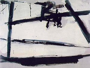
Franz Kline, Untitled, 1957 - Formalist abstract expressionism
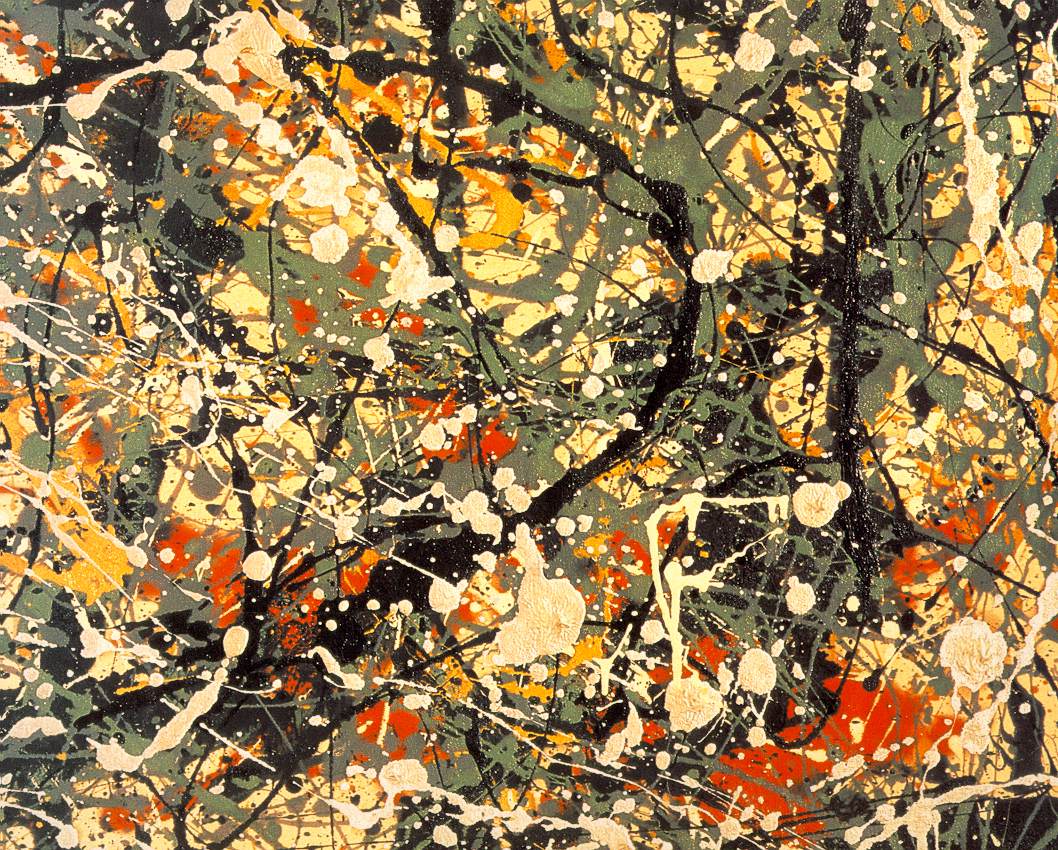
Jackson pollock - Truth to materials, Modernist painting
1965 - Roy Lichtenstein ->Red Painting
Makes Kline - Screenrints in the same style, how can a screenprint be emotional
1978 - Andy Warhol - oxidation painting
Pissed all over copper metallic paint and urine on canvas. Literally taking the piss. Directly attacking the pretentiousness and elitism of modernism work.
David Stringley
'Art Lovers'
2006
->People try to make art that has a high price tag instead of trying to change the world. Damien Hirst?
Piero Manzoni ' Artists Shit' 1961
Canned his own shite. What's inside though, anyone ever opened it. Sold for thousands of pounds. Not a love of art. Again attacking pretentiousness and elitism. Only way to know is to open and then you've ruined the art work or you've opened a can of shit. No win. Very clever.
1984 - Frederic Jameson
Warning of afect - 'A culture of 'retro' styles'
"Advertising is the greatest artform of the 70th century"
Lost interest in "art"
*Quote 2 sums up well
"Generally post-modernism artists like to mix the highbrow and the populist, the alienating and the accessible, and to 'sample' elements from different styles and eras...
now you can reinvent yourself endlessly, gaily pick 'n' mixing your way through the gaudy fragments of a shattered culture'.
Simon Reynolds - The Guardian 1990
E.g. Hip is post modernism, referending funk and jazz.
Memphis Group, founded in 1981.->playful
David Carson - Ray Gun May 1992
Memphis group, bookcase. Form OVER function
Crisis in confidence, but also - freedom, new possibilities, questioning and limitations, space for marginalised
Jamie Reed - Punk movement -> Sex Pistols -> Examples of PM. Rejectes idea of skill, technique, cut, stick and photocopied. Mass copies of same art work.
Negative + angsty, make things cheaply.
IN CONCLUSION
- A vague disputed term
- Post modernism attitude of questioning conventions, especially modernism
- PM aesthetic > multiplicity of styles + approaches
- Shift in thought + theory investigating 'crisis in confidence' E.g. Lyotard
- Space for 'new voices'
- Rejection of technological determinism?
Wednesday, 19 October 2011
CoP Lecture 1 (051011) Modernity and Modernism
Posted on 13:27 by cena
MODERNITY
1. Terms - 'modern','modernity'
2. Modernity - Industrialisation, urbanisation - the city
3. Modern artists - response to the city
4. Psychology and subjective experience
5. Modern art and photography ->didn't exist before modernity
6. Modernism in design ->architecture, graphic design, modernist art
John Ruskin 1819-1900 - Wrote a book called Modern Painters
William Holman Hunt - The Hireling Shepherd (1852)
Moral Lesson
is keep your eye on the job, don't be so randy. Kind of art was described as modern. At the time quite shocking, new. Old fashioned moral lesson. Described as modern at the time, actually quite old.
Modern - nowadays carries a value judgement - Anything "modern" is automatically better. E.g. TATE MODERN
Attaching the word modern usually usually means a progression
Fashion wouldn't exist without this idea.
The meaning of modern has changed over the years.
Paris 1900>modern age, most radical progressive city on the planet.
Later replaced by New York
People usually say modernity finished in the 60's.
Industrialisation was major effect on movement and progress
Urbanisation -> factories worked 24 hours a day
->brought with it many people to the city, thrust together with dense population, rather than rural communities.
Invention of trains->connected villages. Whole country accessible, world shrinks
Telephone was also invented, world seems to shrink further
New forms of entertainment, cinemas etc
Trattoir Roullent -> Paris exhibition ->alectric moving walkway
Paris exhibition ->exhibition of new inventions etc
Modernisation + Urbanisation starts to change your relationship with society Has an effect on our subjective consciousness
Great Exhibition - Crystal Palace 1851 -> competition
Paris Exhibition - Paris - 1855 -> race - who can be the most modern?
Things progress even faster
Process of rationality and reason
Enlightenment = period in late 18th C when scientific/philosophical thinking made leaps and bounds
Secularisation -> people 'ditching' god. Science over religion
The City - Paris
*Eiffel Tower built for 1889 exhibition -> symbolism. Rises above historic 'traditional' buildings and stands high and proud in the Paris skyline.
Truth to materials. Showing off technology/new materials and what it's made of.
Scale>Drive, ambition, power
Not everyone was happy with this pace of change
With rail network and world being smaller. time across countries had to be standardised. Something we take for granted today.
Fashion starts to become key identifier of identifying your role (jobs,class, role)
Hausmanisation
Paris 1850s onwards = a new Paris
Napoleon did over Paris, Hausman redesigns a NEW Paris.
Narrower streets, replaced by large boulevards - poorer people pushed out, became an aristocratic city, form of social control?
Arists start turning the city into a subject for art
->In the past, paintings were just for church, myths etc and now things are changing.
->Becomes a subject of Art
->Portraits of peoples experiences with city
->City is more of a subject than the people
Everyone seems quite lonely and isolated in thought
->1893 ->Psychology labs, first ones. Experiments. Growth of psychology
Monet - The Balcony 1880
->Painting of disconnected family, emotionally, modern family?
Changes in world. Electricity, science, etc. Almost forced art into a different plae. Society modernises art > not other way round.
Fashion becomes even more important. Rich people, would stroll slowly around the city -> Flanners/Flannery. Differences in class. Peoples interactions changed. Bigger social divide?
Seurat - Isle de la Grande jatte (1886)
>Made from dots, when you step back, it creates an image. Something new and kinda groundbreaking. Experimentation.
>That technique was adopted from evolvement in science. e.g. discovery that light travels in RGB
Shift time>work time
life becomes alot more disconnected.
Degas-Absinthe Drinker (1876)
->Getting pissed because life is so crap
->Composition is quite unique
->Direct influence of photography>brought into it new ways of cropping. Photography challenged and reacted painting.
Kaiserpanorama 1883 - Open seat inviting you to come sit down. Watch art/photography/pornography!
..People are prepared to pay and sit down and look at photos of the world rather than going out and seeing it themselves on their doorstop.
Technology becomes a fetish. People experiencing from technology, rather than first hard experience.
Max Nordan - Degeneration 1892
(an anti modernist) wrote about his worries on the world.
-Predicted
-half the time in a railway carriage
-Find their ease in the midse of a city inhabited by millions
-Constantly called to the telephone
The Lumiere Brothers - First Films ->video of oncoming train, people run out screaming
Films back then looked like witchcraft to the moviegoers.
MODERNISM
If we start to thing about the subjective experience
Modernism emerges out of the subjective responses of artists to modernity.
Contrast between:
Monet - Gare St. Lazare 1876
Powerll Hurth - The Railway Station 1862
-Modernism
Invention of photography makes portraits 'obsolete'. Makes paintings different. Abandon realism for expression.
New world allows you to take photos from high level, love, etc. Different view on the world.
Science experiments give us more understanding of how we ourselves function. Same time as e=mc2 by Einstein was workedo ut. Theory of relativity.
Futurist paintings > Giacomo Balle
Picasso - Not paint realistically, paint body from variety of angles at once. Creativity a 360 degrees sense of the body. Les Demoiselles D'Avignon (1907)
Modernism in Design
Informed by social experience of modernity
-Anti-historicism
-Truth to materials - Material not disguised e.g. Eiffel Tower
-Form follows function - simplicity, Bauhaus etc. Beauty comes from it's functionality.
-Key feature of modernist, GD is function for design
-Technology
-Internationalism - one language for all
Cutlery from great exhibition 1851 - definitely not modernist.
Contrast.
Bauhaust cutlery set 1930's - Pure modernist design. still looks new, Thought, Letting it look like what it's made of. Style that's eternal
-Adolf Loos 1908 - "ornament is Crime"
-No need to look backward to older styles
-Don't try and make your designs trendy, because trends go out of date, not timeless.
-Strip the designs, that design will never go out of fashion.
-Form follows function.
BAUHAUS
-Interdisciplinary - artists taught designers taught photographs etc.
-Bauhaus building in Dessau ->Truth to materials
-Massive window for art school. FUTURA created at Bauhaus movement everything NEW + FRESH
Walter Gropius house - still looks really contemporary - stripped down everything
almost designed life > everything is modern
Mies Van der Rohe - Barcelona Chair - Form follow function
Marcel Brear - B3 - Wassily chair
Bauhaus shut down when Nazis to came to power
INTERNATIONALISM
>A language of design that could be recognised and understood by anyone on a international basis
e.g. London Underground Map - Harry Beck
>Designed to be understandable to everyone -> copied by basically every country's underground
>Le Corbusier - Plan Voisin 1927
- Style of a building, very standardised, very erratic decoration, cropped up all over the world. Skyscrapers etc.
Herbert Bayer's san serif typeface
-Argued for need of serifs
-Argued for all text to be lower case, in the days of movable type
Times New Roman Font -> Stanley Morrison 1932
>References classical rome celebrates nationality
Fraktur font - Nazi font
-References the Geometric - backwards looking, historical nationalist.
TECHNOLOGY
e.g. Stilleto heels - reinforced design and steel core made heels possible.
New Materials
-concrete
-new technologies of steel
-plastics
-aluminium
-reinforced glass
MASS PRODUCTION
cheaper more widely accessible products
Variety of products
Tuesday, 18 October 2011
PICTOGRAMS
Posted on 11:12 by cena
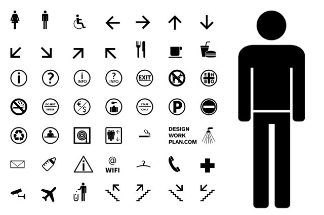
I think If I don't go down the photograph/stock photo route, I'll definitely use icons/pictograms. This is sill very new to me, I have little practise and looking at existing work always help for creativity and helping with the technical stuff.
The pictograms need to work on their own too, on the image only poster. They need to be simple and concise. In my mind I like the idea of having an off lightbulb>brain>on lightbulb. It shows a hard situation, a bit of brainpower and bam! amazing solution. Could look quite cool just in the centre of a poster with lots of space around it to nice effect.
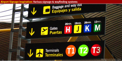
Anyways, check these out. So simple, so effective. Leads back to the semiotics stuff we've been doing with Fred in Design Principles.
I find all this stuff really interesting. At the end of the day, all they are, are very very simple shapes that hardly resemble photorealism yet our brain just registers them as something in a split second.
Like the sort of handprinted traditional quality to the last 2 pieces.
Subscribe to:
Comments (Atom)


