a mushtaq

  • Subscribe to our RSS feed.
  • Twitter
  • StumbleUpon
  • Reddit
  • Facebook
  • Digg

Tuesday, 18 October 2011

LAYOUTS/COMPOSITIONS FOR PROVERBALLY YOURS

Posted on 08:11 by cena
Some nice ones I straightaway thought of, and some that I found. They all take a very different approach but have the same general purpose. Maybe I can take a similar approach as my purpose is also to inspire/advise/motivate


Nothing Past, Nothing Future by Matt Chase

Really like the way he's cleverly combined imagery and metaphors you subtly recognise, with the words. For example, the "Future" text, looks like it's really moving and heading 'into the future'. This looks really nice and clean, a look that I find myself going for with my poster so it's relevant. Really like the way he's signed it in the corner too, with the sort of embossed badge thing. I don't know if I'll have time to do any fancy production method like that but I could definitely sign it with a little badge in the corner. Definitely something to think about.


A is for rebel

Again, this is quite smart, yet quite clean and easy on the eyes too. I really like just keeping it simple with simple one tone graphics on stock. In both these cases - black. I think my own work, if I kept a similar style would look quite nice on some nice cartridge stock, or sugar paper.


by Alida Rosie Sayer

This is a very interesting effect, It's probably handmade and then photographed. Again, time is not on my side, otherwise I would have loved to do something like this. I think this brief is also an exercise in making decisions and quick so this is something I need to keep in mind, although I really like this.

By Oli Phillips

Ahh. Something quite similar to my initial poster idea. I guess nothings new nowadays! I like the way he's got the ribbons beginning and end sections going off to the side. They're not as long as mine and it leaves space at the top and bottom, an issue I had with mine. If I add pictograms, where will they go? So I think this might be a good solution for my own work.

Creativity by Marius Roosendaal

Nothing wrong with keeping it simple. I think this is the look I want to go for, again I've only got a couple of days to wrap everything up, so simple and not fussy is the way to go I think. I like the way the author of the quote is referenced at the bottom. I'm the author of my quote, maybe I can sign it with my own name? That's an idea. Might also add a little lighthearted touch to it aswell.

Keep Calm and Carry On by the British Government in 1939

Couldn't miss this out, could I? Again, very clean and precise. Choice of type is obviously very, very, important with any design work, but more so with work of this simplicity. Another thing to keep in mind.

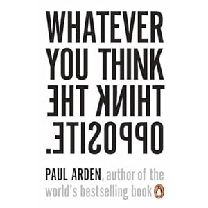
Paul Arden has many motivational books. Again in this example, clever solutions.


Very good books actually. Again, layout, type, colour choice, all work together.


This kind of stuff is also really big on the internet. Known as "motivational posters" Most students will probably be aware of them so a play on this could be useful. Although I don't see a chance for much creative graphic design, taking this route. It's meant purposely to look shabby!
Email ThisBlogThis!Share to XShare to Facebook
Posted in OUGD403, Proverb | No comments
Newer Post Older Post Home

0 comments:

Post a Comment

Subscribe to: Post Comments (Atom)

Popular Posts

  • TED: Creating Your Logo
    Source:  http://www.ted.com/pages/creating_your_tedx_logo Cool to see what typefaces, spot colours etc organisations use for their logos. //...
  • MEMORABLE ACTION MOVIE/CLOSE SHAVE/INGENIOUS MOMENTS
    As part of the imagery aspect of my brief, I like the idea of adding references to films, through iconography or film stills. I'm trying...
  • Publication:: Presentation Boards
    Modernism_ Japan x Europe Presentation boards for  Monday's group discussion. Topics covered Concept Subject Research Publication Resear...
  • Tokyo World Design Conference _ 1960
    Tokyo World Design  Conference                 1960                            As I'm now still keeping a close eye on the development o...
  • Josef Müller-Brockmann: Principal Of The Swiss School
    Really interesting and articulate overview of JMB's career and the state of Switzerland, Europe and at length the world post-WWII and du...
  • designboom: Massimo Vignelli interview
    massimo vignelli designboom interviewed massimo vignelli on may 21st, 2006 what is the best moment of the day? when I go to bed with a feeli...
  • Lithography In India
    Interesting to read about lithography printing around the world for publications that have nothing to do with contemporary graphic design fo...
  • 100 GREATEST REGGAE SONGS OF ALL TIME
    Source 1.   No Woman, No Cry  -  Bob Marley & the Wailers    2.   Israelites  -  Desmond Dekker & the Aces    3.   Stir It Up  -  Bo...
  • Morihei Ushiba - The Art of Peace
    I've ordered The Art Of Peace by Morihei Ushiba , it's a philosophy book on Bushido and Martial Arts philisophy by a legendary Aiki...
  • Process : Embossing
    As part of my research into basic definitions of different finishing processes I'm now looking into embossing, how it's done and the...

Categories

  • 100 Things
  • Alphabet Soup
  • Collect/Categorise/Communicate
  • Colour Theory
  • Communication Is A Virus
  • Context of practice
  • Cop3
  • Crit Techniques
  • Design For Print
  • Design for Web
  • END OF MODULE EVALUATION
  • Essay notes
  • How To Be A Best Man
  • How To Buy A Diamond Engagement Ring
  • illustrator
  • It's Your Choice
  • Lecture notes
  • Level 05 Essay
  • Level 05 Publication
  • Love/Hate
  • My Red Book
  • OUGD01
  • OUGD401
  • OUGD402
  • OUGD403
  • OUGD404
  • OUGD405
  • OUGD406
  • OUGD501
  • OUGD502
  • OUGD503
  • OUGD504
  • OUGD505
  • OUGD601
  • Personal
  • Photoshop brief
  • Proverb
  • Psychoanalysis
  • Publication
  • Room For Sale Poster
  • Stamp it
  • Study Task 1
  • Study Task 2
  • Study Task 3
  • Study Task 5
  • Task
  • Task 1
  • The Poster Brief
  • THREE
  • Typo-Gateaux
  • Typography
  • What Is A Line

Blog Archive

  • ►  2014 (21)
    • ►  March (1)
    • ►  January (20)
  • ►  2013 (105)
    • ►  December (8)
    • ►  November (7)
    • ►  October (6)
    • ►  September (30)
    • ►  July (1)
    • ►  June (1)
    • ►  May (13)
    • ►  April (10)
    • ►  March (5)
    • ►  February (20)
    • ►  January (4)
  • ►  2012 (228)
    • ►  December (18)
    • ►  November (41)
    • ►  October (23)
    • ►  September (1)
    • ►  May (38)
    • ►  April (18)
    • ►  March (45)
    • ►  February (23)
    • ►  January (21)
  • ▼  2011 (83)
    • ►  December (18)
    • ►  November (37)
    • ▼  October (19)
      • COOL BUSINESS CARD
      • LECTURE 3 - GRAFFITI/STREET ART
      • Lecture 2: Postmodernism
      • CoP Lecture 1 (051011) Modernity and Modernism
      • PICTOGRAMS
      • INTERESTING INVENTION ENCYCLOPEDIA WEBSITE!
      • EXAMPLE + SOLUTION
      • Inventors/Inventions
      • GENERAL PHOTOS WHICH MAY WORK
      • MEMORABLE ACTION MOVIE/CLOSE SHAVE/INGENIOUS MOMENTS
      • LAYOUTS/COMPOSITIONS FOR PROVERBALLY YOURS
      • PROVERBALLY YOURS - RESEARCH PLAN
      • ALPHABET SOUP - TYPEFACE
      • Alphabet Soup - Typeface
      • Alphabet Soup - Typeface
      • Alphabet Soup - Typeface.
      • Alphabet Soup: Type
      • Critical Studies Image Analysis Exercise
      • Context of Practice//Seminar Task 1 - Love/Hate
    • ►  September (9)
Powered by Blogger.

About Me

cena
View my complete profile