As a starting point to beginning to think about the publication, we were given a task to go through our design context blog and identify 10 significant pieces of source material or starting points that could be developed into a publication which has a personal value and interested in it.
Here are the 10 I've identified
1: Russian Revolution
I found the Russian revolution really interesting, especially the art and design and moviemaking that went into it. Such as the movies by Eisenstein. There's obviously volumes of research out there that I can look into. I wrote an essay on the subject so I think I have a good basis. Visually, Russia had a very distinct style post civil war.
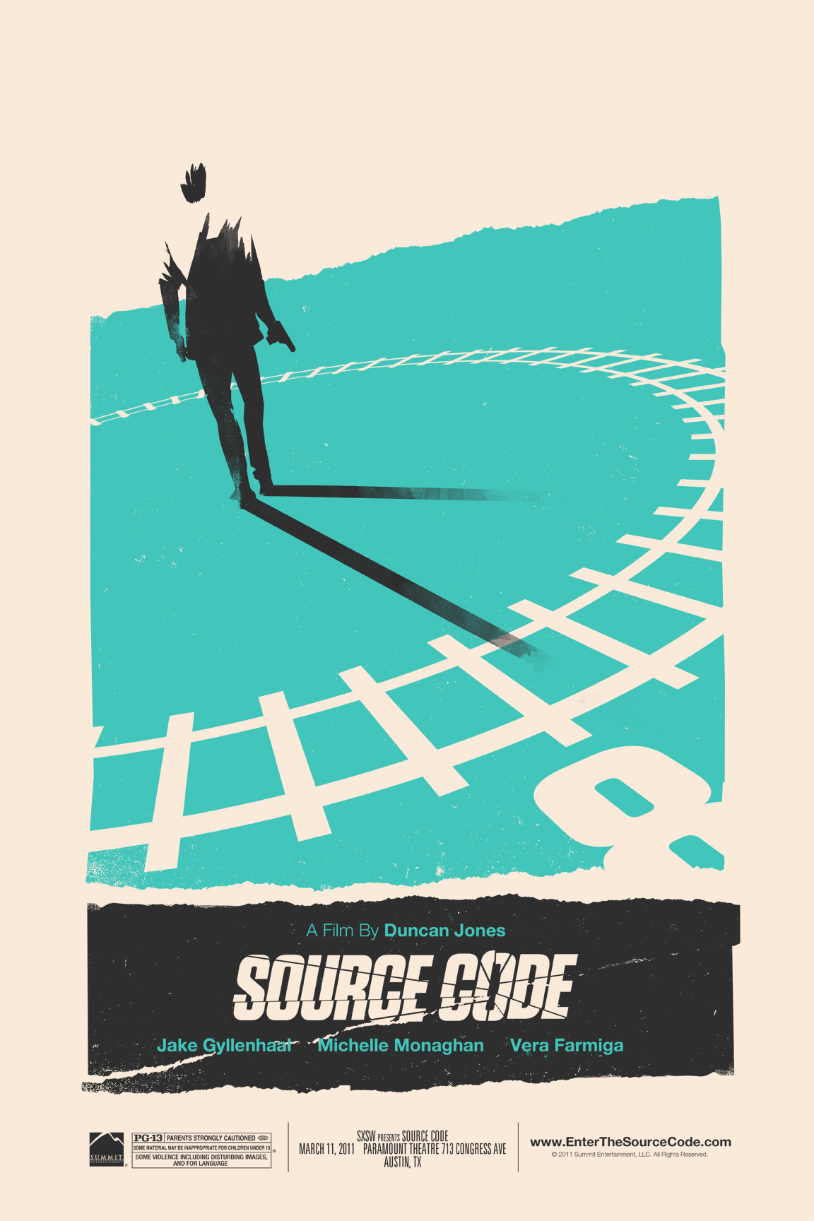
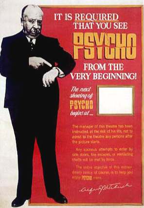
2. Hitchcock
I found the Hitchock lecture fascinating and find the man himself very inspiring. I think it would translate to a publication perfectly. It makes sense in my head, especially as Saul Bass is synonymous with Hitchock's movies so it'd be fun to somehow mix the both and create a publication giving information on the cutting edge techniques and facts about Hitchcock and his movies in a visual way. Would be fun. Also I could be creative with how the user interacts with the content once I outline the content.
3. Film Auteurs
Also found this lecture pretty interesting, think French and European New Wave cinema had a very distinct visual style and it'll be cool to explore.
4. Manifesto's
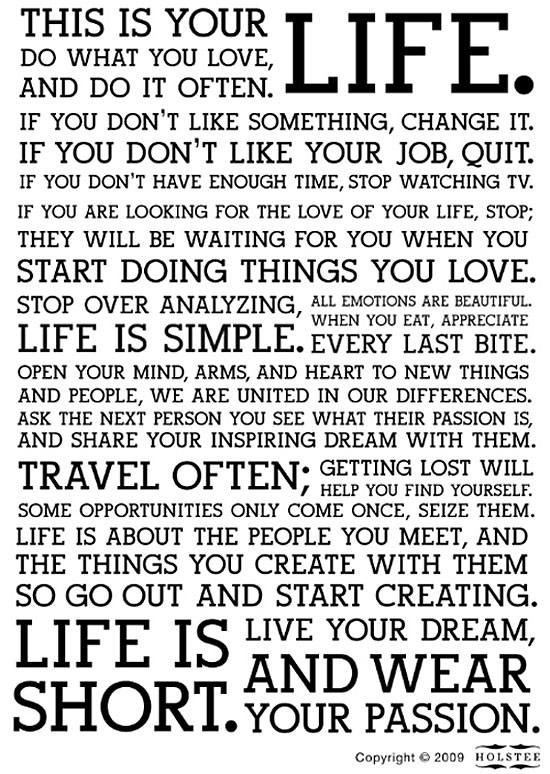
As part of a Jo task we looked into manifestos, and I found them very interesting and inspiring. Maybe I could look into manifestos and create a sort of 'self-help' publication just so that people can pick it up and be inspired and to think of life in a much more positive and better way. It'd be pretty visual though, don't just want massive paragraphs and paragraphs of copy.
5. Graffiti/Street Art
Graffiti and illustration is something I've always really been into, the lecture itself barely delved into graffiti and it'd be interesting for me to personally to delve into it more. Maybe create a factfile showing the beginnings, the rise, the change in graffiti and where it's at now.
6. Accidental inventions
For my 403 Design Skills module a while back I looked into accidental inventions as part of my proverb posters brief and it was really cool. For example popsicles were invented when a guy left his drink with a straw inside it in his garden overnight!
7. Art of manliness/being a gentleman
This was for my collecting brief as part of the 405 Design process module. I find the whole manners/being a gentleman thing really interesting and the whole etiquettes and classical mannerisms that a 'man' does or should do. I think visually it can be really cool. I like all these old retro barbershop logos etc and the use of moustaches etc to promote manliness. I think it could probably be quite humorous and be easy to pick up and read.
8. Constructivism
An art movement that continually inspires me and influences my work. I love Rodchenko's work and love the social and political agenda of the Constructivists. They literally wanted to construct society through design, which I find interesting. Obvious choice is to have a constructivist aesthetic to the publication but I could probably be a bit more less obvious with the interaction and function of the publication.
9. Movie cliches
I looked into Bollywood and Indian Cinema cliches as part of the OUGD405 module and I think looking into overall movie cliches on the whole would be great fun. I'm just really into movies generally, everything about them. Visually it could work well, with each cliche illustrated, or possibly adding some sort of interaction such as pulling tabs, pop-out folds etc.
10. Advertising
The lecture and seminar on advertising was quite interesting. I find the whole corporate and marketing side of advertising quite interesting and the whole subliminal messages and psychology to it. Maybe a factfile, figures, stats etc would be cool. I don't really know how I could make this dynamic and interesting though, as of right now.
As it stands, my favourite and one I have a good feeling about is going ahead with Hitchock. I'm interested to find out more about Hitchcock and I love Saul Bass' work too so researching both would be really enjoyable.
So, a fair bit of layout work is coming my way at the moment with the layout stuff with Lorenzo in Design Principles and Task 5 'Who Are You' brief in PPP. There's not much point in me calling myself a graphic designer if I'm going to just make bog-standard stuff, personally I like idea-led stuff, but that also has a logic to it and isn't just going mad Jackson Pollock style. It was also one of my goals for the second semester to be more experimental. I really like experimental layouts and would love to make time to sink my teeth into it. Here are some which I liked and gave me pointers and ideas towards my own layouts...
www.joelevey.com
I think with stuff like this, I tend to get better ideas just drawing, it helps me consider things better rather than just going straight to the computer, subconsciously it's easy to just make things really linear and take the easy option.
Really like this one colour on stock stuff, has a zine quality to it. Maybe for PPP and Seb's DPS I can find out his favourite colour?
Charlie Hillhouse
Reynald Phillipe
What I like about these are they just look inviting to read, they use space nicely also the copy isn't pretty small like you'd find in a newspaper or magazine, it looks to be a bigger pt. size and it suits this style very well.
Martin Peterson
Alexander Lis & Samuel Banzingler
Stock works really well on here, again I really like the pt size, and leading etc on the copy. Little things go such a long way.
Annette Holand
Neven Allgier
Opportunities are endless, you can literally do whatever you want. I think it's just about drawing, the more you draw the more you push through the obvious boring stuff and start doing more interesting stuff.
So last week we had a briefing on the second part of the OUGD401, Context of Practice. In essence, we need to collate an area of interest and study from previous lectures/workshops and tasks and create and collate it together into a publication of some sort.
My essay was on the social change in Russia and Germany affecting art and design in their respective countries and how they were both similar but had different legacies, playing close interest to Russian constructivism and modernism in Europe, especially Bauhaus. Initial thoughts of mine were that I'd probably create a publication of some sort giving information on Russia and notable facts and figures in a visual way representative of that time period and style.
We had a lecture in a seminar on the topic and I obviously looked deeper into it and wrote an essay so I know a decent amount on it, so that's a good start.
So visually it would take cues from aesthetics like this...
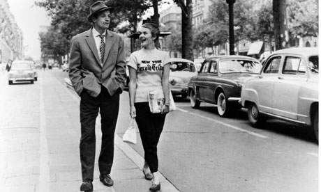
After further thought, I remember I quite enjoyed the film lecture, I'm really into movies as it is and find Hitchcock a pretty brilliant filmmaker and a pretty inspiring individual. His cutting edge film techniques are really interesting and visually it's perfect for me as Saul Bass is synonymous with Hitchock's movies and aspects of Saul Bass' style is a style that I'm trying to develop myself personally, so visually I think I'd really enjoy this. Also film posters in general, especially ones from the 40s, 50s and 60s are something I never get bored of.
The content of the lecture is here. Obviously I'll need to have a further enquiry into it and find some cool things out.
Visually, initial signs point to adopting a mixture of cues like these...