I've made a decision regarding the aesthetic style of the product range to be a little more progressive, with a reference to classic Japanese print and visual particularities rather than pay more of a complete homage, as this has already been done and continues to be done.
My original idea for the packaging for all the product collections was for a wooden box, with some sort of slide lid. I'm getting away from this idea now ,I feel it's too much of a homage, and too sort of 'expected'. A more contemporary package style but with references is what I'm after now.
In terms of stock, Im looking for thick card, greyboard, cardboard or something similar. Below is existing forms of protective packaging which I like aspects of and may pick and choose bits of for my own packaging.
Love how uniform and perfect the above example looks when closed - almost like a book. I want to have this same appeal when the package is closed and I like how when opened it's still sturdy and easy to access.
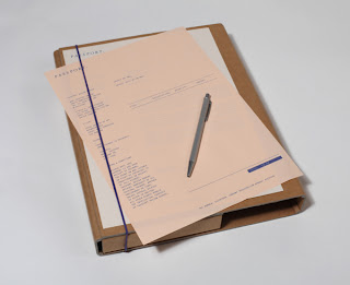
Really like the above two examples, they're fairly similar too. The cardboard packaging is self-branding by Passport dB. I like the string idea to hold the box shut when closed, I want to incorporate this into my package, maybe with elastic band or string. Most likely blue string to form the colour palette i'm working with
String fastening idea is interesting too inst


0 comments:
Post a Comment