


A HISTORY OF TYPE
Carol Twombly
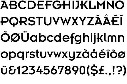
Twombly is an American graphic designer and typographer who has designed many typefaces which are used widely in modern design such as Trajan, Myriad and Adobe Caslon. She was also interestingly the first female winner of the 1994 Prix Charles Peignot, given by the Association Typographique International. Trajan itself is based on Roman square capitals, and is obviouslly influenced by a part of history and an important stage in the history of type. A topic that was touched upon on the History of type lecture. I find it interesting that in the old days, the whole point of a serif was it gave the chisel a point to lead in, to produce an even letterform. Nowadays it's mainly for aesthetic reasons, especially for on-screen use.

Trajan, 1989
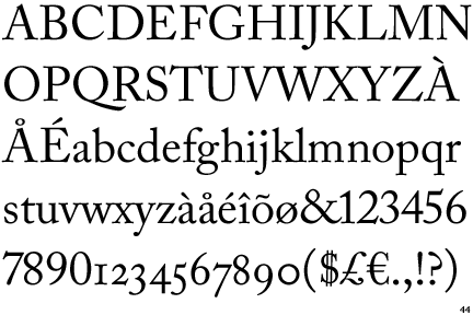
Adobe Caslon. The original Caslon was designed by William Caslon

Erik Spiekermann
Spiekermann is a German typographer and graphic designer who has produced some of the widely used typefaces of today and is sometimes referred to as the godfather of modern type. He's also the brains behind FontShop, the first mail-order distributor of fonts. Probably his most famous typefaces are FF Meta and FF Unit, with high amount of focus on legibility and communication at all sizes. Watching Spiekermann and reading about Spiekermann it comes across he's really very fascinated with type and the smallest details like kerning, tracking etc and some of his quotes reinforce this. He's famously a critic of Helvetica, referring to it as just bad taste. Spiekermann is a pretty outspoken and articulate guy so watching him speak about type and design is often very interesting and educating.
"It's air, you know. It's just there. There's no choice. You have to breathe, so you have to use Helvetica. "
"Most people who use Helvetica, use it because it's ubiquitous. It's like going to McDonald's instead of thinking about food. Because it's there, it's on every street corner, so let's eat crap because it's on the corner."
"I'm obviously a typeomaniac, which is an incurable if not mortal disease. I can't explain it. I just love, I just like looking at type. I just get a total kick out of it: they are my friends. Other people look at bottles of wine or whatever, or, you know, girls' bottoms. I get kicks out of looking at type. It's a little worrying, I admit, but it's a very nerdish thing to do. "
"A real typeface needs rhythm, needs contrast, it comes from handwriting, and that's why I can read your handwriting, you can read mine. And I'm sure our handwriting is miles away from Helvetica or anything that would be considered legible, but we can read it, because there's a rhythm to it, there's a contrast to it. Helvetica hasn't got *any* of that. "


^^interesting comparison! I really like the large prominent 'tittle' on the i's on Spiekermann's fonts, they craeate a nice balance and break away from the regimented look of Helvetica but at the same time being highly legible and efficient.

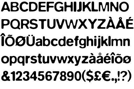
Extreme weights of FF Meta
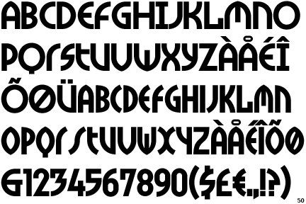
Neville Brody
Neville Brody is a nationally renowned British graphic designer who is prominently known a graphic designer who often deals with layouts and type and image such as his work in the 80's on The Face and Arena magazine and album covers for post-modern artists such as Depeche Mode. He's worked in a variety of fields and also designed various typefaces which I find quite interested and often quite post-modernist in their aesthetic, but then he's also done some pretty modernist and legible typefaces. I like how much variety Brody's work has.
"An electrician isn’t an opinion former, but a graphic designer is. My argument is that all graphic designers hold high levels of responsibility in society. We take invisible ideas and make them tangible. That’s our job."
FF Meta Subnormal

FF Dirty Faces
FF Blur Medium
FF Dome
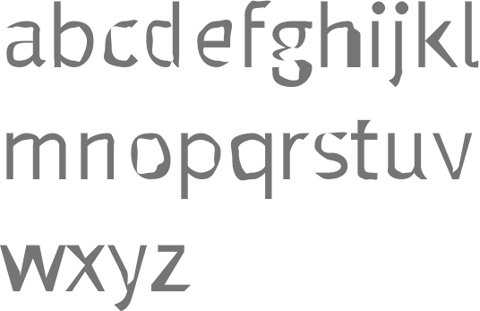
FF Insignia Font
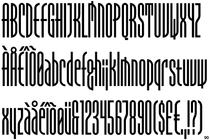
FF Tokyo
Claude Garamond
A French publisher and designer from Paris. He was one of the leading type designers of his time (1500's) He's credited with introducing apostrophe, the accent and gedila to the French language. He's had an influence on several contemporary typefaces, such as Garamond, Granjon and Sabon. He worked as an assistant to Geoffrey Troy -- a French humanist and engraver. This influence in humanist typography probably influenced Garamond's own work.
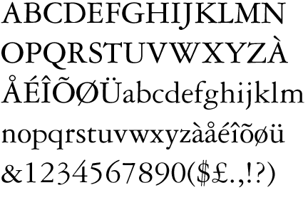
Garamond

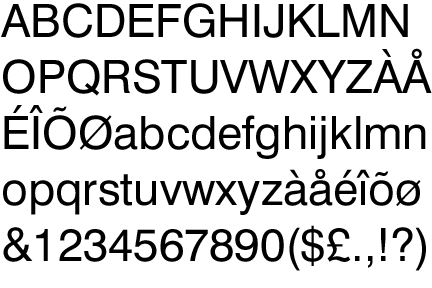
Max Miedinger
Max Miedinger was a Swiss graphic and typeface designer. In the 20s Max trained as a typesetter, he went on to create the iconic Helvetica in 1957. It instantly became iconic of Swiss design and cutting-edge technology and design. It's probably the most widely used commercial font today with a massive following, mainly down to it's flexibility and lack of 'character' allowing it to be placed in almost any situation and still fitting into context. Although I think people exagerrate this too much, it's simply an efficient and legible sans-serif font with very rigid and standardised stems and widths, many other fonts have the same attributes too. Such as some of Spiekermann's fonts, or Akzidenz Grotesk from the late 19th century.
Max didn't only create Helvetica though, even though it's his most iconic. He created other typefaces such as Swiss 921, Swiss 721 and Monospace 821.


Swiss 921 BT. It's clear that it's influenced Impact -- probably my least favourite font ever.
Swiss 721

Monospace 821
Adrian Frutiger
Frutiger is another swiss designer who was noticably influential on type design and especially digital type design in the second half of the 20th century, and the 21st century. After his education in Zurich, Frutiger moved to Paris where he started to work at the Deberny & Peignot typefoundry. Here he helped the foundry move classic typefaces used with traditional printing methods to newer technologies. He is best known for creating the typefaces, Univers and and Frutiger.
"If you remember the shape of your spoon at lunch, it has to be the wrong shape. The spoon and the letter are tools; one to take food from the bowl, the other to take information off the page... When it is a good design, the reader has to feel comfortable because the letter is both banal and beautiful."
"Helvetica is the jeans, and Univers the dinner jacket. Helvetica is here to stay."- Adrian Frutiger


0 comments:
Post a Comment