a mushtaq

  • Subscribe to our RSS feed.
  • Twitter
  • StumbleUpon
  • Reddit
  • Facebook
  • Digg

Monday, 8 October 2012

Study Task 1 - What is Design for Print? // Publishing and editorial

Posted on 09:16 by cena
Iowa/NPDA Mailer and Poster - Christopher Santoso

"The concept of this mailer/poster was conceived out of the idea to signify a connection between the states surrounding Iowa, and create something identifiably midwestern. Bird illustrations, along with hand rendered and slab serif type were implemented based on my personal background of being a midwesterner. The final print resulted in a finish akin to a screen printed poster."

I particularly like this piece as it's a style I'm very much personally interested in and drawn towards, again it's the idea of using colour efficiently and well and using the stock to your advantage. He's screenprinted these and I think he's merged two different cultures and backgrounds really well. The colours are very vibrant which is probably tough to get through a traditional print process, the layout and hierarchy also works very well in my opinion and the mailer looks appealing and interesting, especially considering the target audience - art students.


GUNMAN design studio - Design team of Icelanding and Danish graphic designer working between Rekjavik and London

GUNMAD seem to have a really cool balance between type and imagery, often with their layouts and published work looking very readable yet bvisually engaging with experimental layouts and a nice pt size and margins etc.

They seem very comfortable with copy and with layout and publishing - two areas I really want to improve upon this year. 
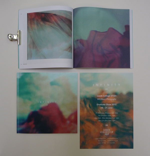


Infinity - Passport
This is the 2012 Yearbook for the LCA photography course designed by ex BAGD students, Jonathan Finch and Rosalind Stoughton, now known as Passport. In terms o the aesthetics of the inside of the book, I wouldn't say personally it's as appealing to me purely in terms of the visual style as it's very effective and minimal, but taking into account the target audience and the finish to the published product and overall thought put into the context of the book and the end of year show itself - it's very effective and impressive. Little things such as the embossed "Infinity" title and the "LCA" embossed.

The layout itself is for a photography course and so rightly so the focus is on photography with the copy taking less prominence.


Dedalo magazine - Oporto University - F
"Dédalo magazine is a publishing project developed by a group of students of Oporto University Faculty of Architecture established as a space for critical intervention based on the encouragement of architectural discussion and the issues that the current discipline raises, never forgetting that the architecture is not an isolated manifestation of the other arts or social sciences."

I chose this work as the visual style appeals to me, I've become really drawn to one colour half-toned photos plus the use of stock in the past yea and the overlayed elements visual style and I think this project pulls it off really well. The space and elements work together in a careful and considered way and definitely is food for thought towards my own work. Empty space is your friend!


Made Quarterly Edition One
A really effective and efficient piece of design in my opinion and I'm drawn to it as I'm wondering what print processed they used. Especially for the white text, Either they printed white onto the light blue stock which is unusual or they had white stock and printed the blue colour on but this is unusual too, especially for a full coverage but the blue colour doesn't look inked.

"MADE focuses on inspirational people from around the world who create incredible things, including but not limited to industrial design, architecture, fashion, interior design, photography and the culinary world. MADE aims to get inside the heads of those individuals to find out how they do what they do, and what inspires them to create. Each issue will take a peek behind the scenes and offer the reader a rare opportunity to glimpse inside the minds of these inspiring individuals."

The layout inside the book is also very efficient clean and minimal which when considering the target audience being probably pretty well-off industrial designers, the design and feel of the book looks spot on. I really like the type too, in terms of the spacing and margins. It looks inviting to read without taking focus away from the photography which is of a high quality.


Email ThisBlogThis!Share to XShare to Facebook
Posted in OUGD504, Study Task 1 | No comments
Newer Post Older Post Home

0 comments:

Post a Comment

Subscribe to: Post Comments (Atom)

Popular Posts

  • TED: Creating Your Logo
    Source:  http://www.ted.com/pages/creating_your_tedx_logo Cool to see what typefaces, spot colours etc organisations use for their logos. //...
  • MEMORABLE ACTION MOVIE/CLOSE SHAVE/INGENIOUS MOMENTS
    As part of the imagery aspect of my brief, I like the idea of adding references to films, through iconography or film stills. I'm trying...
  • Publication:: Presentation Boards
    Modernism_ Japan x Europe Presentation boards for  Monday's group discussion. Topics covered Concept Subject Research Publication Resear...
  • Tokyo World Design Conference _ 1960
    Tokyo World Design  Conference                 1960                            As I'm now still keeping a close eye on the development o...
  • Josef Müller-Brockmann: Principal Of The Swiss School
    Really interesting and articulate overview of JMB's career and the state of Switzerland, Europe and at length the world post-WWII and du...
  • designboom: Massimo Vignelli interview
    massimo vignelli designboom interviewed massimo vignelli on may 21st, 2006 what is the best moment of the day? when I go to bed with a feeli...
  • Lithography In India
    Interesting to read about lithography printing around the world for publications that have nothing to do with contemporary graphic design fo...
  • Jessica Svendsen : 100 Days : Müller-Brockmann
    Jessica Svendsen is now a designer at Pentagram, under the tutelage of Michael Beirut. Michael Beirut runs the 100 days workshop where you b...
  • 100 GREATEST REGGAE SONGS OF ALL TIME
    Source 1.   No Woman, No Cry  -  Bob Marley & the Wailers    2.   Israelites  -  Desmond Dekker & the Aces    3.   Stir It Up  -  Bo...
  • Process : Embossing
    As part of my research into basic definitions of different finishing processes I'm now looking into embossing, how it's done and the...

Categories

  • 100 Things
  • Alphabet Soup
  • Collect/Categorise/Communicate
  • Colour Theory
  • Communication Is A Virus
  • Context of practice
  • Cop3
  • Crit Techniques
  • Design For Print
  • Design for Web
  • END OF MODULE EVALUATION
  • Essay notes
  • How To Be A Best Man
  • How To Buy A Diamond Engagement Ring
  • illustrator
  • It's Your Choice
  • Lecture notes
  • Level 05 Essay
  • Level 05 Publication
  • Love/Hate
  • My Red Book
  • OUGD01
  • OUGD401
  • OUGD402
  • OUGD403
  • OUGD404
  • OUGD405
  • OUGD406
  • OUGD501
  • OUGD502
  • OUGD503
  • OUGD504
  • OUGD505
  • OUGD601
  • Personal
  • Photoshop brief
  • Proverb
  • Psychoanalysis
  • Publication
  • Room For Sale Poster
  • Stamp it
  • Study Task 1
  • Study Task 2
  • Study Task 3
  • Study Task 5
  • Task
  • Task 1
  • The Poster Brief
  • THREE
  • Typo-Gateaux
  • Typography
  • What Is A Line

Blog Archive

  • ►  2014 (21)
    • ►  March (1)
    • ►  January (20)
  • ►  2013 (105)
    • ►  December (8)
    • ►  November (7)
    • ►  October (6)
    • ►  September (30)
    • ►  July (1)
    • ►  June (1)
    • ►  May (13)
    • ►  April (10)
    • ►  March (5)
    • ►  February (20)
    • ►  January (4)
  • ▼  2012 (228)
    • ►  December (18)
    • ►  November (41)
    • ▼  October (23)
      • The Gaze: Women in Media
      • The Gaze: Seminar
      • Thinking With Type
      • Anatomy of Type
      • Lecture 3 - Panopticism
      • Examples of Type and layout
      • Design for Web: Existing Websites
      • Process : Embossing
      • You've Been Foiled!
      • Foil Blocking & Spot Varnish examples
      • Printing techniques
      • Psychoanalysis & Subliminal advertising
      • The Birth of Mad Men: Ernest Dichter by Laura Massey
      • The Engineering Of Human Desire by Tai Carmen
      • Psychoanalysis in advertising
      • Lecture 2 - The Gaze and The Media
      • Context of Practice Seminar ~ Psychoanalysis
      • 10 Websites - Good/Bad/Unsure
      • Lecture Notes 1 x Psychoanalysis
      • Study Task 1 - What is Design for Print? // Publis...
      • Study Task 1? - What is design for print? // Infor...
      • STUDY TASK 1 - What is design for print? Packaging...
      • STUDY TASK 1 - What is design for print? // Brand ...
    • ►  September (1)
    • ►  May (38)
    • ►  April (18)
    • ►  March (45)
    • ►  February (23)
    • ►  January (21)
  • ►  2011 (83)
    • ►  December (18)
    • ►  November (37)
    • ►  October (19)
    • ►  September (9)
Powered by Blogger.

About Me

cena
View my complete profile