a mushtaq

  • Subscribe to our RSS feed.
  • Twitter
  • StumbleUpon
  • Reddit
  • Facebook
  • Digg

Sunday, 7 October 2012

Study Task 1? - What is design for print? // Information & Wayfinding

Posted on 04:59 by cena
L2M3 

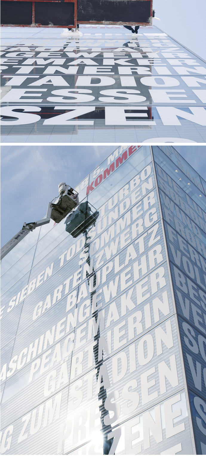
L2M3 is a German graphic design studio which predominantly deals with information and wayfinding. What I like about them is the boldness and clarity of their communication, using colours and type and scale. Along with that they've done some anamorphic stuff too, where you get the message from a certain angle which is placed at perfectly placed contexts so it will shock you when you happen to be walking through one day and it perfectly merges in front of your eyes! Very cool, efficent and effective. The variety of their work and styles is impressive too.

I really like the ceiling stuff, it challenges conventions and in fact looks very effective. It's kind of there as you're walking and helps guide you along with the arrows, you don't have to keep your eye out for little signs. It's kind of like a TomTom device just guiding you, which is great.


Follow The Hands - Cathy Wu
A wayfinding system for non-English speakers to navigate through the Univeristy of Washington Art Building. It's based on the idea of universal hand signals that we can all understand and I find it really cool and effective in the idea of semiotics and takes advantage of it very well. It's visually engaging and guides you nicely around the building. It takes something boring like signage and makes it interesting. It also produces effective signage without type and without the generic icons used worldwide, which is interesting.

I like it as it's probably a very simple and easy to produce solution for a problem that was probably quite challenging. Projects where the process and thought process is complicated but the solutions are refreshingly simple and made them think "why didn't we think of this sooner?" always interest me.


Beijing Subway Ticket


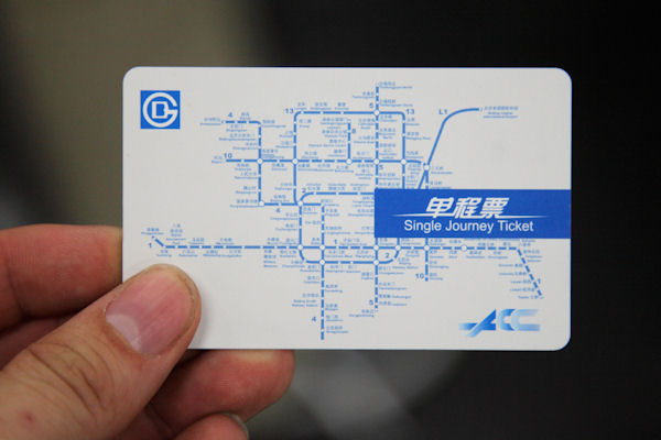
I picked this as it is a well thought out and nicely designed ticket, it also has extra use and reusability to it with the Beijing Subway map. They made something which is clearly mass produced and usually a pretty throwaway item into a piece of graphic design which looks appealing, and has a usability to it beyond just putting into ticket barriers. It's ALOT better than what we get here


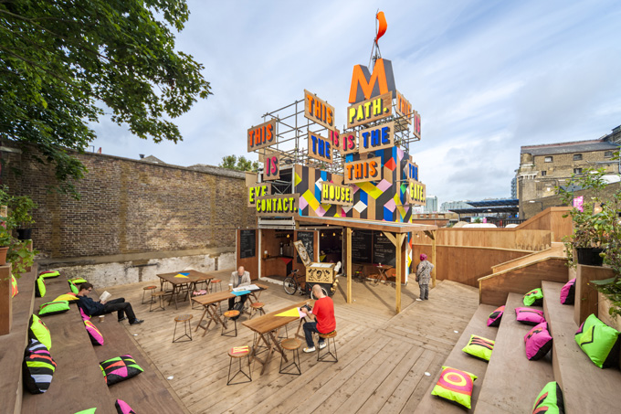
Movement Cafe, South East London

The Cafe was designed by Morag Myerscough. I like the really cool use of colour, it's bright vivid and energetic. It was launched to coincide with the Olympics just down the road, the cafe is located next to the Greenwich arena used for some of the Olympics. It also takes into account plane and depth so from a certain angle all the signage aligns and you can read what it says and it draws you in. The effect works from all 4 angles and sides of the structure.


Michael Faraday  Community School signage - Cartlidge Levene
Taking into account the target audience of this signage which will most likely be kids and parents, it needed to be big, and bold and appealing to the kids and I think the signage achieves this very well. There's no confusion and it efficiently does it's job with big 3d arrows and contrasting colours which work well together such as black and yellow.


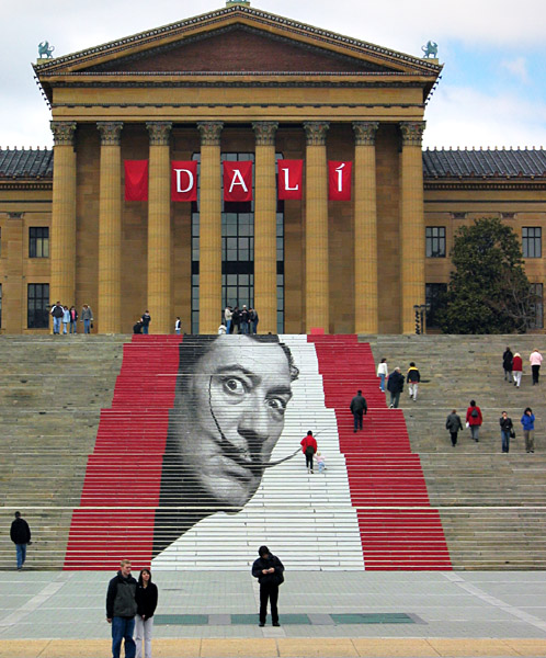
Salvador Dali Exhibition - Philadelphia Museum Of Art
Really like this as it takes into account the building the exhibition is in itself and adds interest and appeal in an innovative way. Dali has an instantly recognisable face and the fact he's plasted onto an Art Gallery makes you figure out the context of the signage yourself.


I can't find out the location of this signage or who it's by, I'll ask around but I think it's very effective. Rather than using signs on the wall or hanging off the ceiling it literally points to and displays the location and information at the same time in a clear and concise way.


Splinter Cell: Conviction
This might be from a game but I think it's relevant as it could easily be applied to buildings and the like and may already have been, I'm sure it will have. Usually in games you get text telling you where to go and where it is, or you might have a map. Conviction had this really cool projection concept where it literally projected onto the objects around you and also projected onto the building itself. It also used this for cutscenes and had moving image projected onto your environment while you walked around -rather than a cut-away to a cut scene you might just want to skip. So it pointed to the location and told you the location at the same time in an innovative way. In real life this projection idea would be really cool.


Email ThisBlogThis!Share to XShare to Facebook
Posted in OUGD504, Study Task 1 | No comments
Newer Post Older Post Home

0 comments:

Post a Comment

Subscribe to: Post Comments (Atom)

Popular Posts

  • TED: Creating Your Logo
    Source:  http://www.ted.com/pages/creating_your_tedx_logo Cool to see what typefaces, spot colours etc organisations use for their logos. //...
  • MEMORABLE ACTION MOVIE/CLOSE SHAVE/INGENIOUS MOMENTS
    As part of the imagery aspect of my brief, I like the idea of adding references to films, through iconography or film stills. I'm trying...
  • Publication:: Presentation Boards
    Modernism_ Japan x Europe Presentation boards for  Monday's group discussion. Topics covered Concept Subject Research Publication Resear...
  • Tokyo World Design Conference _ 1960
    Tokyo World Design  Conference                 1960                            As I'm now still keeping a close eye on the development o...
  • Josef Müller-Brockmann: Principal Of The Swiss School
    Really interesting and articulate overview of JMB's career and the state of Switzerland, Europe and at length the world post-WWII and du...
  • designboom: Massimo Vignelli interview
    massimo vignelli designboom interviewed massimo vignelli on may 21st, 2006 what is the best moment of the day? when I go to bed with a feeli...
  • Lithography In India
    Interesting to read about lithography printing around the world for publications that have nothing to do with contemporary graphic design fo...
  • Jessica Svendsen : 100 Days : Müller-Brockmann
    Jessica Svendsen is now a designer at Pentagram, under the tutelage of Michael Beirut. Michael Beirut runs the 100 days workshop where you b...
  • 100 GREATEST REGGAE SONGS OF ALL TIME
    Source 1.   No Woman, No Cry  -  Bob Marley & the Wailers    2.   Israelites  -  Desmond Dekker & the Aces    3.   Stir It Up  -  Bo...
  • Process : Embossing
    As part of my research into basic definitions of different finishing processes I'm now looking into embossing, how it's done and the...

Categories

  • 100 Things
  • Alphabet Soup
  • Collect/Categorise/Communicate
  • Colour Theory
  • Communication Is A Virus
  • Context of practice
  • Cop3
  • Crit Techniques
  • Design For Print
  • Design for Web
  • END OF MODULE EVALUATION
  • Essay notes
  • How To Be A Best Man
  • How To Buy A Diamond Engagement Ring
  • illustrator
  • It's Your Choice
  • Lecture notes
  • Level 05 Essay
  • Level 05 Publication
  • Love/Hate
  • My Red Book
  • OUGD01
  • OUGD401
  • OUGD402
  • OUGD403
  • OUGD404
  • OUGD405
  • OUGD406
  • OUGD501
  • OUGD502
  • OUGD503
  • OUGD504
  • OUGD505
  • OUGD601
  • Personal
  • Photoshop brief
  • Proverb
  • Psychoanalysis
  • Publication
  • Room For Sale Poster
  • Stamp it
  • Study Task 1
  • Study Task 2
  • Study Task 3
  • Study Task 5
  • Task
  • Task 1
  • The Poster Brief
  • THREE
  • Typo-Gateaux
  • Typography
  • What Is A Line

Blog Archive

  • ►  2014 (21)
    • ►  March (1)
    • ►  January (20)
  • ►  2013 (105)
    • ►  December (8)
    • ►  November (7)
    • ►  October (6)
    • ►  September (30)
    • ►  July (1)
    • ►  June (1)
    • ►  May (13)
    • ►  April (10)
    • ►  March (5)
    • ►  February (20)
    • ►  January (4)
  • ▼  2012 (228)
    • ►  December (18)
    • ►  November (41)
    • ▼  October (23)
      • The Gaze: Women in Media
      • The Gaze: Seminar
      • Thinking With Type
      • Anatomy of Type
      • Lecture 3 - Panopticism
      • Examples of Type and layout
      • Design for Web: Existing Websites
      • Process : Embossing
      • You've Been Foiled!
      • Foil Blocking & Spot Varnish examples
      • Printing techniques
      • Psychoanalysis & Subliminal advertising
      • The Birth of Mad Men: Ernest Dichter by Laura Massey
      • The Engineering Of Human Desire by Tai Carmen
      • Psychoanalysis in advertising
      • Lecture 2 - The Gaze and The Media
      • Context of Practice Seminar ~ Psychoanalysis
      • 10 Websites - Good/Bad/Unsure
      • Lecture Notes 1 x Psychoanalysis
      • Study Task 1 - What is Design for Print? // Publis...
      • Study Task 1? - What is design for print? // Infor...
      • STUDY TASK 1 - What is design for print? Packaging...
      • STUDY TASK 1 - What is design for print? // Brand ...
    • ►  September (1)
    • ►  May (38)
    • ►  April (18)
    • ►  March (45)
    • ►  February (23)
    • ►  January (21)
  • ►  2011 (83)
    • ►  December (18)
    • ►  November (37)
    • ►  October (19)
    • ►  September (9)
Powered by Blogger.

About Me

cena
View my complete profile