Really cool process shown through photos, looks a lot of fun
//
10DEC/09
Lithographic printing
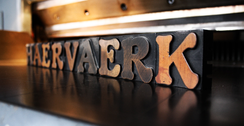
Some time ago, the good people at The Graphic Workshop in Hjørring invited me to do their annual folder, which usually consists of three to four lithographic prints and a text sheet. It just so happened, that I had some weekends and a little vacation coming up, and since I figured there would be no match for spending several days in graphic paradise, I didn't have to think twice before accepting their offer.
 The Graphic Workshop in Hjørring - a true gem!
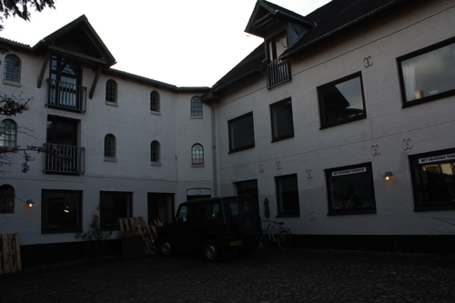
Outside view of the workshop.
"Det Grafiske Værksted" was established in 1984, when the society currently running the workshop, succeeded the legendary lithographic printer J. Chr. Sørensen. A lot of cool artists like Asger Jorn, Wilhelm Freddie and Poul Anker Bech have visited the workshop through the years.
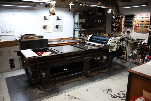
Lithographic printer.
This is the old Czechoslovakian lithographic printer from the 50's. A nice piece of machinery and a real working horse (although it did have a mind of its own!).
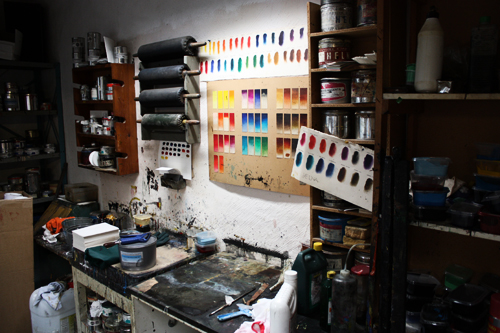
Color mixing station.Lot's of colors and inspiration everywhere; I am a huge fan of stuff in tin cans, so most of the time I wasn't even sure whether I was alive, or had died and gone to heaven.
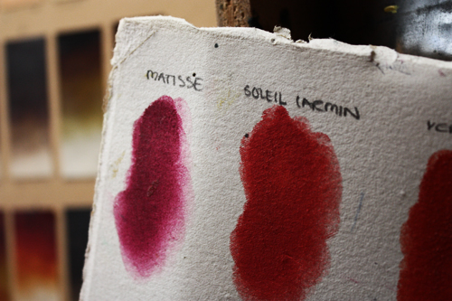
Color samples.Apparently "red" isn't just red. Ever since my shows in Paris, I've had a thing for french words, so I had no complaints about these weird names for red.
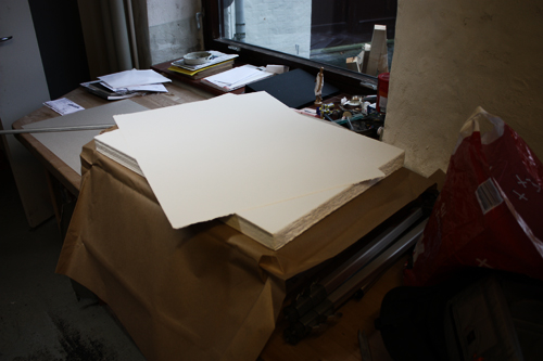
Lot's of paper.We went for some pretty heavy-duty stuff without too much structure.
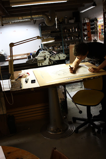
Image transferring.Things had been real busy for me, so I hadn't had too much time to prepare for this project. I didn't start working on my sketches until the night before leaving for Hjørring, but somehow I managed to come up with something with a nice "series-appeal" to it.
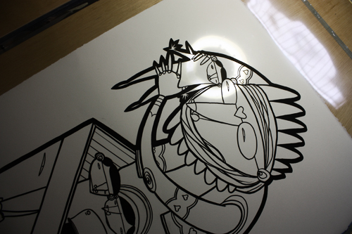
Black cliché.I spend the first day working on the black clichés; a piece of transparent film was put on top of my rough sketches, and I just basically traced them with a black marker.
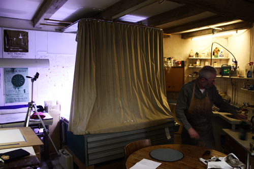
Plate burning.After the film had been traced, it was put on top of a light-sensitive aluminium plate and burned with a huge ultraviolet lamp!
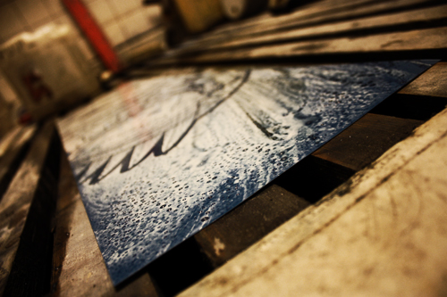
Washing.When the plate had been exposed for some time, the parts that hadn't been masked off on the film would wash right off.
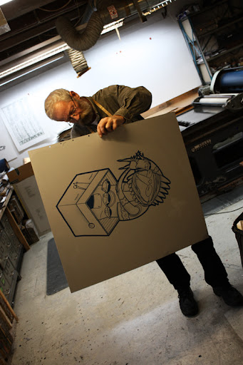 Thiesen drying the first aluminium plate.
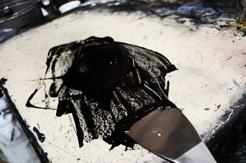 Black.
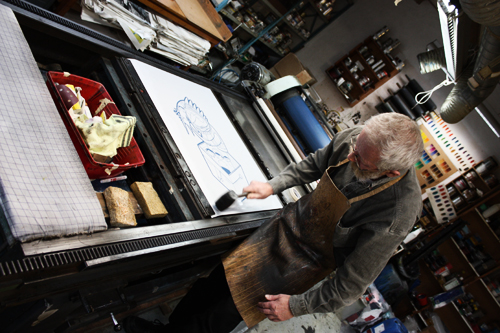 Preparing for the first run.
Whacking stuff with a rubber hammer is always good fun!
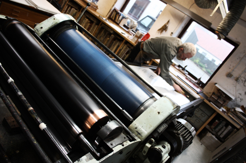 Adding moisture to the plate.Apparently this was quite important - I never did quite get why..
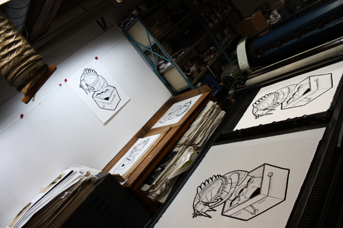
Lot's of prints!
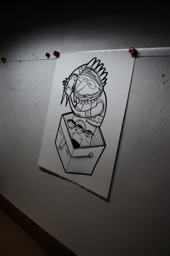
Detail.
This is the first run, black on white. This is also the first sketch I did, and since I really liked the whole box-thing, I figured I'd use it in all three prints. It sort of adds a nice series-feel to it!
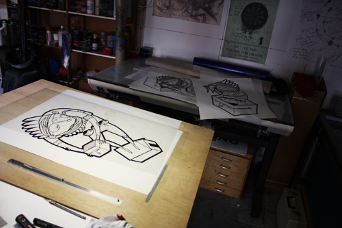
More black clichés.
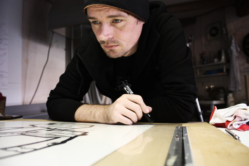
Making decisions.
I never really worked with rough sketches and transparent film before, so sometimes I actually had to think!
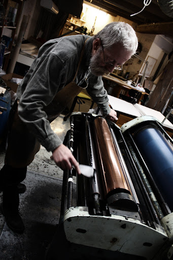
Thiesen adding even more color.
The whole color-thing is more or less like rocket science; it involves transparency, fading, shading and much more. I usually just plaster a canvas in paint, but I learned that that's not how you make lithographic prints!
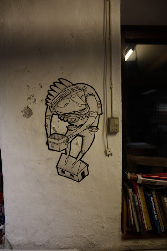
Wheatpaste.
Yup, the test prints turned out to be pretty useful too!
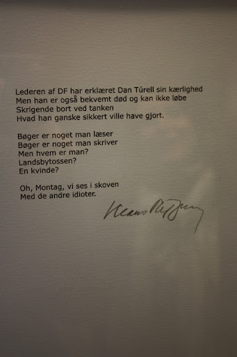
Klaus Rifbjerg.
During lunch break, we went to see the workshops exhibition called "Kunst for millioner". Lot's of cool stuff; above is a nice attack on the Danish Peoples Party (racist, bigot scum!) by Danish author Klaus Rifbjerg. If you look at the picture long enough, you might spot Iben and me.
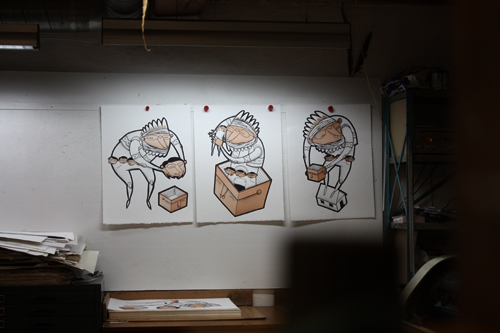
Adding colors.
After running the black prints, we decided to work on the skin-tones.
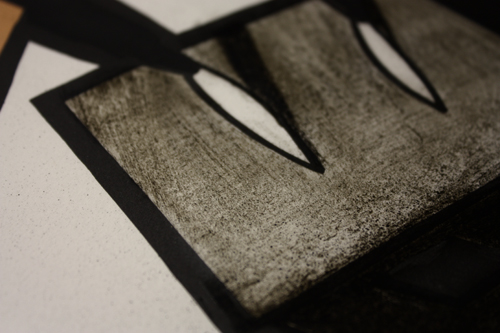
Rooftop shading.
Using lithographic chalk to add shading and details for the brown cliché.
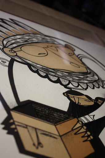
Layering.When doing lithographic prints, you only have a limited color-pallet. It was time to think about layering colors, and I started working with brown on bits and pieces, that would later turn out red, purple, blue and green.
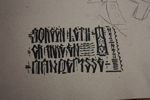
Jorgen Leth.
- er IKKE en mandefisse.
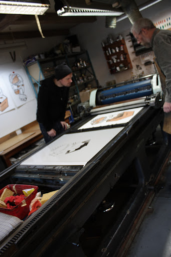
Printing browns.
Thiesen and me evaluating the first run of brown prints.
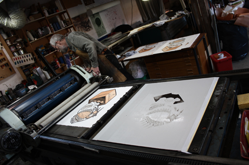
Technical issues.
Our Czech friend started acting like a bitch (again!).
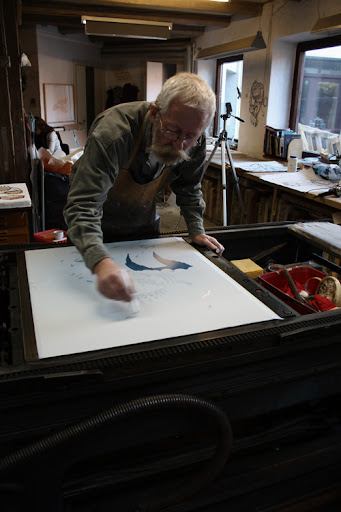
Cleaning.
Thiesen cleaning the plate of specks and dust.
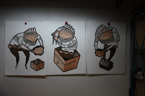
Trio.
Black, skin and brown.
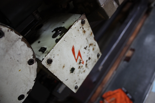
Danger, danger!
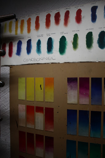
Color picking.
Next color was going to be blue, so we started zeroing in on the right scheme.
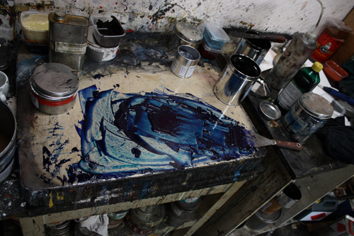
Blue Velvet.
This is what we ended up with; a nice and deep blue.
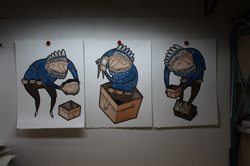
Trio.
Black, brown, skin and blue.
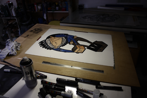
Adding details.
Next up was the red color.
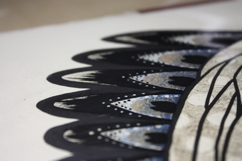
Peacock.
Again I had to think in layers, when deciding how to do the peacock feathers. I know some of you think that the feather-dudes are indians, but actually they're inspired by traditional Danish folkdancer headgear and by Danish author, Tor Nørretranders' peacock allegory. Tor will also be making the text sheet for my project.
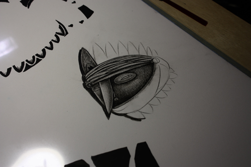
Chalking it up.
Every now and then, it was just nice to fool around with something completely different.
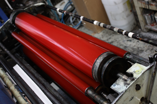
Purest candy!
Next up would be the red, and we went for a ruby-red, which turned out amazing. If I could marry a color, this would probably be it!
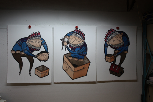
Trio.
Black, brown, skin, blue and red.
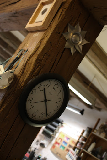
Foil flower.
Someone made this awesome flower from empty beer cans. I've seen these beautiful things around Aalborg too, so I'm guessing that it's done by a local artist.
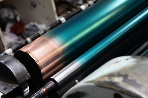
Green hangovers.
Next morning (only a bit hung over from the aquavit-party the night before), we started running the green prints.
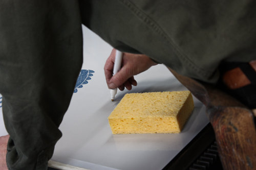
Cleaning specks n' dust.
Thank God Thiesen wasn't involved in the Aquavit!
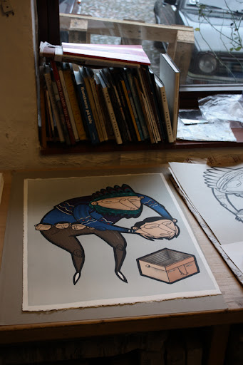
Final print!
After the green, we added a nice light grey background, and it turned out beautifully! After three grey prints, the Czech bitch broke down.


0 comments:
Post a Comment