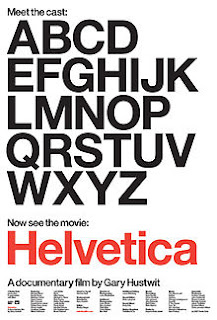
Helvetica is a movie by Gary Hustwit exploring the birth of Helvetica and it's influence across Europe and the world, this was a bit of a no-brainer to watch as it was designed by Max Miedinger in 1957, at the height of Swiss modernism and their objective and highly typographic visual style, at this stage perhaps completely discarding photography - with designers such as Muller-Brockmann going full typographic
It also touches upon the influence of Helvetica on American graphic design which on its surface again seemed to be very consumerist driven with celebrated design often being branding and advertising - Helvetica and it's symbolism of Swiss design had a profound effect on advertising which in turn affects American culture.
It's interesting to find out the intentions of Helvetica as a piece of design.
---------------------------------------------------------------------------------
"It's like air, it's like gravity"
"It's ubiquitous. Let's eat crap because it's on the corner." - Spiekerman
* designer has an enormous social responsibility
VIGNELLI
Fight against the ugliness. Visual disease. We try to cure it.
The distance between letters. *Typography is really white. Space between letters.
It's like music, the space between the notes makes the music.
AmericanAirlines
*I use no more than 3 typefaces
*Type shouldn't be expressive. "Dog" doesn't have to look like a dog
Had to be MODERN
* 1950's. Development of Graphic Design. Post-war period. Idealism. European designers in particular felt Graphic Design is a part of rebuilding and reconstructing society. Similar to the Constructivists and El Lissitsky. Period of early experiments.
*Social Responsibility
Karl Gernster
Emergence of Swiss Style of design
Helvetica emerges in 1957.
WIM CROUWEL
"I love modernism."
*"I don't like using different typefaces"
It should be clear, readable and understandable.
Invented a grid. "Within the grid, I play in it." -
I need to use this for atleast one of the applications of Euro design to Japanese design
* "A tool of creating order."
Computers speed up work. The design isn't better, but quicker.
*In 1960's most design was in 2-3 layers. Unlike today
Sketches widely, close to finished. Typefaces are very important, almost the biggest decision about the design.
'Neutral' typefaces. Which don't scream attention but effortlessly do the job
"Neutralism was a word we loved."
Harry Carter - Typographer
* Most type designers would start with a lowercase h. Tells you width, curvature, height, ascender height, nature of serif or sans-serif. Then an o as this is rounded to contrast against straight sided h. Then a lowercase p as it's a mixture of straight and round. From here so much DNA. b, d, q and many other type forms can be made.
HELVETICA
Horizontal terminals
"Die Neue Haas Grotesk" original name
Max Miedlinger. Typographer who designed Helvetica in 1957
Haas Type Foundry - Helvetica was born here.
Edward Hofmann
The letters. Counters. Letters fit snugly and pefectly in the surrounding space. Negative space is clearly very important, more so than the letterforms maybe.
Means "The Swiss Typeface" in Swiss.
The feeling of turning script and over cluttered 50's ad design to Helvetica felt like an "Icy glass of cold water". Changed ad design in the 1950's.
Periods and full stops, bold, short taglines replaced paintings, portraits and exclamation marks.
From...

To...

Neutral and reliable. IRS tax forms in Helvetica. People want it to look efficient, but also human with curves.
Typeface invites open interpretation
"Gotham Typeface" uses for Tribeca Film Festival
ERIK SPIEKERMAN
*A real typeface comes from handwriting. There's a rhythm to it.
Helvetica has no rhythm.
Swiss ideology = Make every letter look the same. That's an army not people
NEVILLE BRODY
Fitting in, doing the job instead of standing out.
* Safety. Peace of mind. Social responsibility.
The typeface of socialism, maybe more so than capitalism?
Post-modernism.
A reaction to conformity. The dull blanket of sameness. A need for change. Vietnam war - Helvetica?
Wanted to get away from the horrible slickness of itself. Produce something with vitality and character.
SAGMEISTER
I was always very bored looking at type.
Started to do our own type, Hand lettering. Lou Reed poster.
DAVID CARSON
"I never learnt what I wasn't supposed to do. So I just did what I felt like."
* Just because something's legible doesn't mean it's communicating the right thing.
Modernism used a lot of cut outs and bold imagery, when used against contrasting colours and bold large type, efficient and clever use of space.
Logical. Unfussy. Stripped down.
EXPERIMENTAL JETSET
* We don't like humanistic typefaces. They have too much expression.
* One pt size if possible
* "Helvetica bold in one size for a flyer. It looks good."
More good young type designers than at any point in history. Late 20's early 30's.
Colour palettes of clues, reds, whites and blacks. Heavy use of negative space and grid, obviously.


0 comments:
Post a Comment