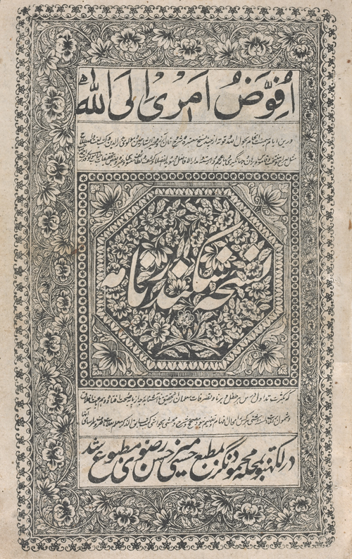
Interesting to read about lithography printing around the world for publications that have nothing to do with contemporary graphic design for a change. This article covers lithography in India and old printing houses such as Mirzā Moḥammad Malek-al-kottāb Širāzi in the late 19th and early 20th century.
Source: http://www.iranicaonline.org/articles/lithography-ii-in-india
//
Source: http://www.iranicaonline.org/articles/lithography-ii-in-india
//
LITHOGRAPHY ii. IN INDIA
From the 19th century to the first decade of the 20th, India was at the hub of a great expansion in lithographic printing. Hundreds of lithographic printing houses flourished in India, and although books in Persian were only a part of their production, it was there that the largest number of Persian lithographed books was published.
LITHOGRAPHY
ii. IN INDIA
From the 19th century to the first decade of the 20th, India was at the hub of a great expansion in lithographic printing. The success of this particular type of printing was largely due to the fact that the same procedure could be applied to all languages irrespective of the varying scripts, since its basis was the manuscript transcribed by a copyist. Hundreds of lithographic printing houses flourished in India, and although books in Persian were only a part of their production, it was there that the largest number of Persian lithographed books was published.
The study of the catalogues of the library collections, of bibliographies containing Persian editions, and of commercial catalogues of publishers (Shcheglova, 2004) reveals two major points. First, the largest percentage of lithographs was printed in Lucknow, followed by Bombay, Cawnpore, Lahore, and Delhi. Secondly, theological subjects headed the list of the most frequently published titles, followed by educational textbooks and belles-lettres. Titles concerned with other subjects were produced in far fewer numbers. Persian lithographs were also published in other cities of India, but their number was not large.
The first lithographed books can be dated to the third decade of the 19th century: 1824 in Benares (Edwards, p. 281), 1826 in Agra (Ibid, p. 717) and Calcutta (Arberry, p. 110) where the Asiatic lithographic publishing house was at work. Up to the middle of the fourth decade of the 19th century, lithography was still a matter of individual experiments. Lithographed books in Persian started to come out regularly from the mid-40s of the 19th century in Bombay, Lucknow, Cawnpore, Calcutta, and Madras, and from the late 1840s in Agra, Lahore, and Delhi.
Lithographic book printing offered employment for those professionals who had earlier been engaged in the production of manuscripts. These included the booksellers, copyists, painters, writers, and scholars involved in editing classical works on various topics and commenting upon them, authors of schoolbooks, etc. The advent of printing also brought lithographers, editors, and businessmen into this venture. The most successful were the lithographers of Lucknow and Cawnpore. The pioneers of the lithograph business in these cities were Ḥājji Moḥammad-Ḥosayn at the Moḥammadi printing house, and Moṣṭafā Khan at the Moṣṭafāʾi printing house in Cawnpore (Ḡaravi, p. 33; Shcheglova, 2001, pp. 18-32); and Mir Ḥasan Rażawi at the Ḥasani printing house in Lucknow (Shcheglova, 2001, pp. 32-33). Their publications were meticulously prepared, with commentaries in the margins and sometimes with special glossaries. Classical compositions published in these printing houses were taken as samples and frequently reprinted by other publishers during the next decades. The lithographic printing house of Mir Ḥasan Rażawi created a template for the title page (FIGURE 1) that was later adopted by the publishing house of Munshi Nawal Kishor and became the standard format for several decades (FIGURE 2).
The middle years of the 19th century witnessed a decline in printing caused by the adverse political conditions that prevailed in the country at the time, but from the 1860s on, the revival of the lithograph activities started in Lucknow and Cawnpore. In Lucknow, lithographic book printing in Persian reached its peak in the 1870s. At the time, out of the total number of forty-three existing presses in the city, there were twenty-five lithographic printing houses, and seven more were added in the early 20th century. In Cawnpore, the number of the lithographic printing houses was considerably less, no more than a dozen. In the 1880s, the book printing was still substantial, but from the 1890s on, a recession started. Even though dozens of lithographic printing houses functioned in Lucknow and Cawnpore, only some of them published books in Persian regularly.
In 1858, the largest national publishing house in India, Oudh Akhbar of Munshi Nawal Kishor (d. 1895), was established in Lucknow. As well as its well-known Urdu newspaper of the same name, it printed books in many languages, mostly in Urdu, but also in Persian and Arabic. The publishing house had a branch office in Cawnpore, another at Lahore from the late 19th century, and, as of the early 20th century, an office in Delhi as well. Munshi Nawal Kishor, a member of the Indian National Congress (INC), aimed at publishing the most significant Persian and Arabic texts of different periods at his publishing house. He therefore organized, in the 70s of the 19th century, a department for translating from Persian to Urdu at his publishing house, where he printed works on the history of Mughal India, compositions on medicine, jurisprudence, and other topics. At the same time, he was engaged in the publication of Persian translations of monumental works of Indian national culture, in particular, the Mahabharata. During the years of his publishing activities (1858-95), Munshi Nawal Kishor printed thousands of editions; his commercial catalogue of 1874 alone contains 1066 books in Urdu, Persian, Arabic, and Sanskrit. Editions in Persian made up one-third of the total number and encompassed almost the entire range of Persian literary heritage (Shcheglova, 2001, pp. 32-80; Ḡaravi, pp. 34-35).
In Cawnpore too, a branch of the Oudh Akhbar publishing house was the largest publisher of books in Persian. There was also another well-established publishing house that printed books in Persian: the Neẓāmi publishing house, belonging to ʿAbd-al-Raḥmān Khan b. Rowšan Šāker. He was the author of several anthologies and published numerous works (Shcheglova, 2001, pp. 88-100).
In Bombay, the first lithographic printing house was founded during Mountstuart Elphinstone’s (1779-1859) governorship of the Bombay presidency (1819-27). According to Mahdi Ḡaravi, the first lithographed book was published there in 1827 (Ḡaravi, p. 32). The superintendent of the printing house was Captain George Jervis, and books connected with his name were published in 1828-32 (Shcheglova, 2001, p. 103). Under his supervision the edition of the Anwār-e soheyli by Ḥosayn b. ʿAli Wāʿeẓ Kāšefi (d. 1505) was lithographed by Mirzā Ḥasan Širāzi in January 1828. The latter was a professional calligrapher and transcribed texts for a series of lithographic editions (Storey, 1933, p. 459, where names of other calligraphers are also mentioned).
Local lithographic printing houses owned by Indian Muslims and non-Muslims began to appear in Bombay in 1840s; for example, one was founded by Ganpatrao Krishnajee (d. 1861) who had been trained as a printer in the USA (Ḡaravi, p. 33). In the late 1850s, there were already about eighteen printing houses, and over twenty others were added to these by the end of the 19th century (Shcheglova, 2001, p. 106). However, only some of them printed Persian books regularly and in significant numbers.
The largest number of books in Persian was published by the lithographic printing houses that belonged to the Pulbandari family: Ḥeydari, Fatḥ-al-Karim, and Karimi (1850s to the first decade of the 20th century). The names of the owners were Qāżi Ebrāhim, Fatḥ-Moḥammad, and ʿAbd-al-Karim. These were purely commercial enterprises that published books in Arabic, Persian, and Urdu. One-third of the Persian-language production was devoted to manuals and textbooks. In 1880s and 1890s, a series of works on the history of the Mughals were published at the Fatḥ-al-Karim printing house (Shcheglova, 2001, pp. 108-22). The following lithographic printing houses operated for a considerable time: Moḥammadi (1840s-end of the 19th century, belonged to various owners), Dādu Miān (1850s-1870s), Dattprasad Press (1880s to early 20th century), and Nāseri (mid-1880s to early 20th century; this printing house had close ties with Persian booksellers).
A significant pioneer in the lithographic book printing in Bombay was the book-publisher and bookseller Mirzā Moḥammad Malek-al-Kottāb of Shiraz (b. Shiraz 1269/1852-53, d. after 1915; FIGURE 3). He strove to publish important medieval texts that fell outside the sphere of interest of other lithographers, and he was in close contact with booksellers from Persia, Turkey, and Egypt. For instance, the 44th issue of his commercial catalogue dated 1911 contains 711 books in Arabic, 548 books in Persian, and 44 books in Urdu (Shcheglova, 2001, pp. 123-36, 147-79; Eadem, 2004, pp. 188-98).
In the two decades spanning the 19th and 20th centuries, Lahore was one of the centers of book printing in Persian. About half of the titles published were concerned with educational textbooks, while a substantial part of the rest was devoted to works on theology. There were also works concerned with diverse issues related to the Muslim community. Commissions from other provincial towns were placed in Lahore too, in particular works by Afghan authors were published here, and a part of production went to the book markets of Central Asia. At various times, thirty-two lithographic printing houses operated in Lahore (Shcheglova, 2001, pp. 180-205).
The earliest books in Persian lithographed in Delhi are datable to the 1840s. Yet, even though about forty lithographic printing houses were at work there, most of them only published the odd volume. Judging by the quantity of Delhi editions in the catalogues, the number of books produced in Persian at Delhi was relatively insignificant (Shcheglova, 2001, pp. 206-16).
The study of the lithographs preserved in library collections and listed in commercial catalogues and bibliographies, shows that the overwhelming majority of the published works had been written before the 19th century. The repertoire of the lithographic printing houses included, above all, the fundamental medieval compositions on theology, Islamic law, philosophy, grammar and lexicography, medicine, history, and belles-lettres. In the 19th century, publishers had continued to reproduce the traditional set of the known compositions, and all printing centers gave preference to the works by Indian authors. At the same time, almost all publishers tried to widen the range of their publications either by publishing contemporary works, or by searching through the manuscript depositaries for interesting or neglected items. Since Persian was on the decline as a living language in India and its current use as a vehicle for social and political discourse was on the wane, the search for forgotten works of the passed centuries proved to be more rewarding.
The commercial catalogue of 1874 by the publishing house of Munshi Nawal Kishor can serve as an illustration showing the ratio of the published books from the point of view of language and subject. The catalogue contains 544 books in Urdu, 249 in Persian, 93 in Arabic, 30 in English, 14 dictionaries (Urdu, Persian, and Arabic), and 136 books in the Devanagari script. With respect to the subject, of the total number of 1,066 editions, 312 were the books for educational purposes, 272 theological works, 217 belles-lettres, 64 historical works, and 52 medical works. The remaining editions contain compositions on various topics (Shcheglova, 2004, pp. 181-82). By way of contrast, the commercial catalogue of 1910-11 issued by the Bombay publishing house of Malek-al-Kottāb contains mainly theological works, followed in the second place by belles-lettres. Books for educational purposes are almost absent from this catalogue.
In a comprehensive list of all the published books, compositions by the 19th-century authors comprise a small part. These are mostly treatises on ritual, manuals for Sufi practices, biographies of eminent Sufis and hagiographies of mystics, some polemical works, a number of works on the history of Muslim rule, and poetic works.
The practice of preferring editions of old texts entailed the development of the publishing culture. Traditional methods of making explanations to the main text in the form of page-by-page notes for separate words (ḥāšia) and continuous commentary to the text (šarḥ) found their continuation in the lithographed books. In Lucknow and Cawnpore from the 1840s on, the publication of educational and other works with detailed explanations of obsolete words and concepts had been in practice, and rules for arranging the glosses and placing them on a page were worked out. The glossary (farhang)—a short explanatory dictionary of obsolete words or terms (juridical, medical, Sufi, etc.)—is taken outside the frames of the text. Both the commentary (šarḥ) and the glossary (farhang) could have been published either together with the commented work, or separately from it. The page-by-page notes (ḥāšia) had remained but shifted from the margins to the lower part of the page. In the end of the 19th century, the šarḥ, the ḥāšia, and the farhang were often composed in Urdu (Shcheglova, 2001, pp. 241-46).
As far as the exterior features were concerned, the Indian lithographed book at first imitated its predecessor—the hand-written book. The first editions published in Lucknow, Cawnpore, and even in those printing houses in Bombay set up by the British, reproduced the make-up of a manuscript, and all data about the author, title, and place of publication was inserted in the colophon. However, the European book culture undoubtedly influenced the local printing practice, and already by the 1840s the main publishing centers had developed new methods of presentation. The lithographed book acquired the title page. The first page, which had earlier remained partially blank, was now used to present information hitherto contained in the colophon only: the name of the author, the title, and the place and year of publication (FIGURE 4). The distinctive feature of the lithographed book was that its title page became the first page, while its verso side contained the beginning of the published text (FIGURE 5). The title page was decorated by ornamentation; the pagination was used along with the catchwords; the title of the work was mentioned above the frame that bordered the text. The structure of the book also changed: introductions by the publishers, tables of contents, epilogues, addenda and corrigenda (FIGURE 6), etc. were distinguished as separate units (Shcheglova, 2001, pp. 248-59).
At the same time, creators of lithographed books followed the traditions that had been worked out within the many centuries and concerned the arrangement of the material on a page, the rules for using various types of script, the highlighting of chapter titles, and the principles of illustration. This has the most striking reflection in the editions of the kolliyāts and the diwāns: the lithographed edition and the manuscript copy were identical. The head-piece (ʿonwān), the empty one-third of a page before the beginning of a section (FIGURE 5) and the colophon of the scribe appear in almost all lithographed editions (FIGURE 7). The same compositions and the same episodes within a work, as those in manuscripts, continued to be illustrated. Most often, illustrations were provided for such works as the Šāh-nāmaof Ferdowsi (FIGURE 8), the Eskandar-nāma of Neẓāmi, the Golestān of Saʿdi, theʿAjāʾeb al-maḵluqāt of Qazvini (FIGURE 9), the Maʿlumāt al-āfāq of Amin-al-Din Khan (FIGURE 10), and Majāles al-ʿOššāq attributed to Ḥosayn Bāyqarā (d. 911/1506, FIGURE 11).
The period of active lithographic book printing in Persian in India came to an end in the first decade of the 20th century. With the change in the role which the Persian language played in the Indian society, the amount and the function of book printing in Persian changed either: from wide mass production to publications of highly specialized works.
Bibliography:
A.J.Arberry, Catalogue of the Library of the India Office, vol. II, pt. 6 (Persian Books), London, 1937.
E.M.A.Edwards, A Catalogue of the Persian Printed Books in the British Museum, London, 1922.
Mahdi Ḡaravi, “Ketābhā-ye fārsi-e čāp-e Hend wa tāriḵča-ye ān,” Honar o mardom102-103, Tehran, 1971.
Ḵānbābā Mošār, Fehrest-e ketābhā-ye čāpi-e fārsi (A Bibliography of Books Printed in Persian), 2 vols., Tehran, 1958-63.
Idem, Fehrest-e ketābhā-ye čāpi-e fārsi, 2 vols., Tehran, 1972.
Fehrest-e ketābhā-ye čāpi-e fārsi az āḡāz tā āḵar-e sāl-e 1345. Bar asās-e fehrest-e Ḵānbābā Mošār wa fahāres-e Anjoman-e ketāb (A Bibliography of Persian Printed Books [1808-1967]), 3 vols., Tehran, 1973.
Š.M.Qoreyši, “Monši Navāl Kišur,” Rāhnamā-ye Ketāb 17, Tehran, 1974.
G.W.Shaw, “Maṭbaʿa. 4. In Muslim India,” EI2 VI, 1991, pp. 804-7.
O.P.Shcheglova, Katalog litografirovannykh knig na persidskom yazyke v sobranii Leningradskogo otdeleniya Instituta vostokovedeniya AN SSSR (Catalogue of lithographed books in the Persian language in the collection of the Leningrad Branch of the Institute of Oriental Studies of the Academy of Sciences of the USSR), 2 vols., Moscow, 1975.
Eadem, Katalog litografirovannykh knig na persidskom yazyke v sobranii Vostochnogo otdela nauchnoĭ biblioteki im. A.M.Gor’kogo Leningradskogo gosudarstvennogo universiteta (Catalogue of lithographed books in the Persian language in the collection of the Oriental Department of the Scientific Library named after A.M.Gorky of the Leningrad State University), Moscow, 1989.
Eadem, Katalog litografirovannykh knig na persidskom yazyke: iz sobraniya Rossiĭskoĭ Natsional’noĭ Biblioteki (Catalogue of lithographed books in the Persian language: from the collection of the National Library of Russia), Moscow, 2002.
Eadem, “Litografskoe knigoizdanie na persidskom yazyke v XIX v. v Irane i Indii (na osnove Sankt-Peterburgskikh kollektsiĭ)” (Lithographic book printing in Persian in the 19th century in Iran and India [on the basis of St.Petersburg collections]), D.Lit. diss., St.Petersburg, 1995.
Eadem, Persoyazychnaya litografirovannaya kniga indiĭskogo proizvodstva (XIX v.) (Persian-language lithographed book of Indian production [19th century]), St.Petersburg, 2001.
Eadem, “Kommercheskie katalogi indiĭskikh knigoizdateleĭ” (Commercial catalogues of Indian book publishers), Pis’mennye pamyatniki Vostoka 1, Moscow, 2004, pp. 177-99.
C.A. Storey, Persian Literature. A Bio-bibliographical Survey, vols. I and II, London, 1927-71; tr. Yu.E.Bregel’ as Persidskaya literatura. Bio-bibliograficheskiĭ obzor, 3 vols., Moscow, 1972.
Idem, “The Beginnings of Persian Printing in India,” in Oriental Studies in Honour of Cursetji ErachjiPavry, ed. Jal Dastur Cursetji Pavry, London, 1933, pp. 457-61.
August 15, 2009
(Olimpiada P. Shcheglova)
Originally Published: August 15, 2009
Last Updated: August 15, 2009
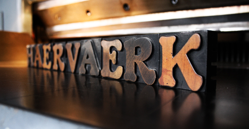
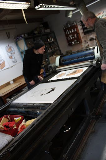
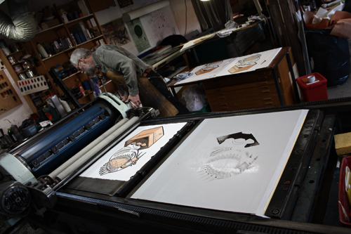
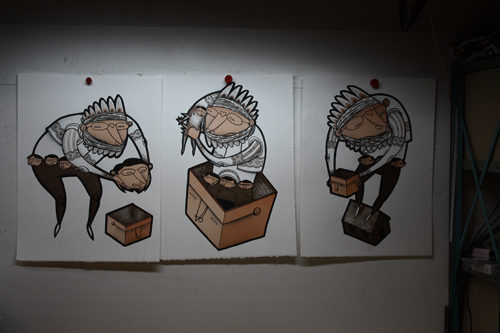
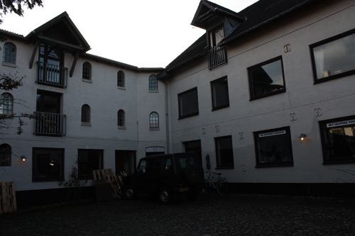
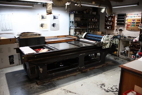
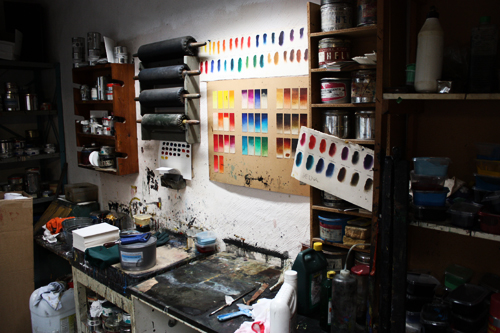
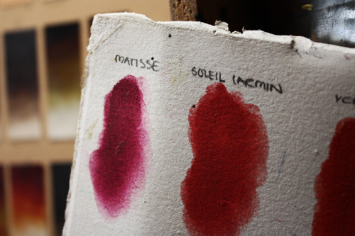
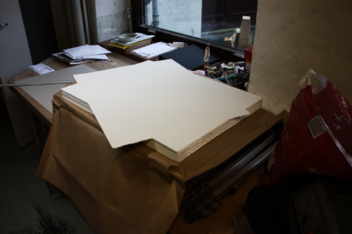
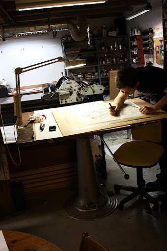
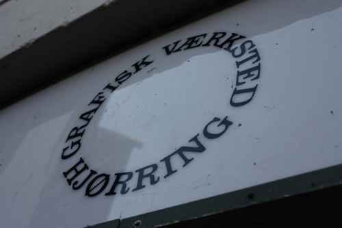 The Graphic Workshop in Hjørring - a true gem!
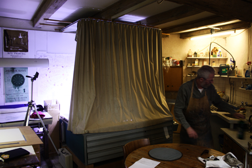
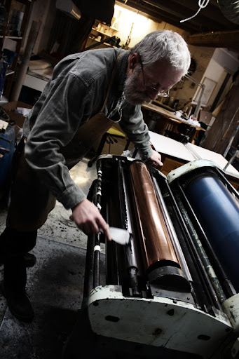
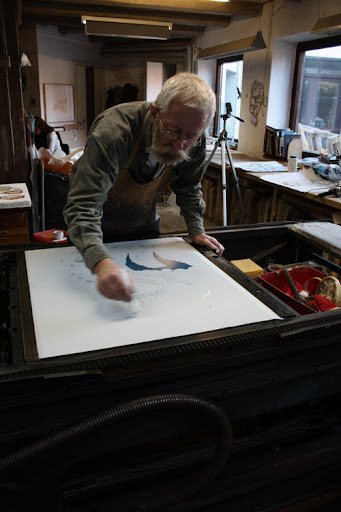
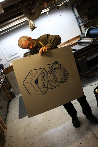 Thiesen drying the first aluminium plate.
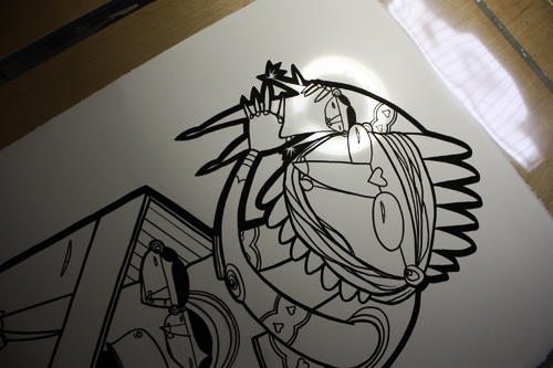
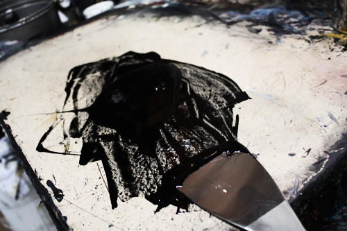 Black.
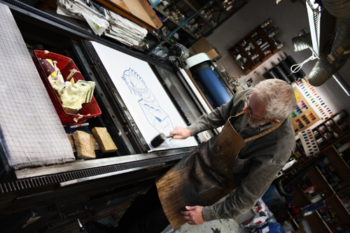 Preparing for the first run.
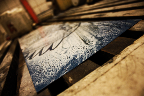
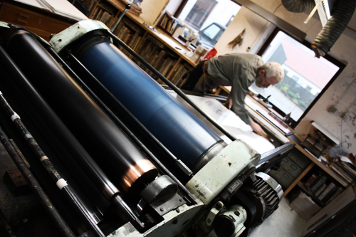 Adding moisture to the plate.Apparently this was quite important - I never did quite get why..