Found this earlier by Catalogue, a design studio down in central Leeds. They've done similar prints based on proverbs and I think they're pretty cool. I like the cryptic quality to them.
The overwhelmingly evident colour is yellow, so it makes sense to make my own crane letterforms yellow aswell to make it clearer the fact it's a crane.
This is something I wish I had more time to explore in my Proverb mail shot brief, but something I did consider as it's environmentally friendly and perfectly suits the campaign.
I really like the whole idea of creating a brand identity, that's kind of what I've been doing and can keep ongoing with the Don't Sin Just Bin campaign stuff. I find it really interesting and cool to look at ways in which the companies aesthetics and character can be applied to anything, from notebooks to stickers to pencil sharpeners or whatever. The photos look really cool too where everything's lined up neatly organised.
I've only made stickers and little postcard type things yet, but I could really go to town with this.
Hecker Guthrie identity design by Cornwell.
HUF. HUF, like alot of streetwear, clothing brands apply their logo to many different items.
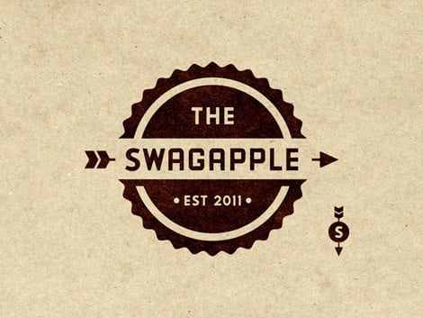
A few things inspired the logo I designed for the Don't Sin Just Bin campaign I've developed. Mainly it was a typographic/illustration approach to a logo, rather than just mainly text alone. I wanted to create a badge type logo that could be hopefully applied to a variety of stuff, a letterhead, business card, side of a truck?! a uniform, building sign etc. I also quite like the vintage look and wanted to have a go at this aeshetic. Here's bits and pieces that inspired the look and feel of the logo, whether it be colour or font choice.
KEEP BRITIAN TIDY also has a range of a more lighthearted approach of posters available to order aswell. This could be an avenue to explore, as I want it to get someones attention and be different to the rest of the junk you get through the letterbox.
Matt Chase is an American graphic designer and illustrator, I generally quite like his style and solutions he makes. I really like his US Postal Service. He makes something so common and uninteresting, and something we overlook - into something really interesting and inviting to look at.
I'd love to take this approach to something to do with a cleaner, maybe rebrand myself as a cleaner and have a logo and a badge and all the other identity stuff.