In my mind, 90's hip-hop is when things got grittier and much more darker, especially in the mid to late 90s and I want to reflect this through the designs, the audience for this will be design students, but as I'm not entering I'm aiming this towards hip-hop heads. There was still plenty of more laid back rap music out there, such aas the stuff by A Tribe Called Quest.
Tuesday, 4 December 2012
ISTD: 80s Hip-Hop visuals
Posted on 13:54 by cena
For my Print and Web brief focusing on creating typographic music deliverables across print and digital.
I'm going to be focusing on hip-hop in the 80s against hip-hop in the 90s and showcase the differences and similarities between them visually.
Here are some examples which I find are really useful in capturing the hip-hop scene in the 80s, one of the core concepts of the brief is to capture the vibe, sound and emotion of each song. I'm yet to decide on which artists to focus on but the aim is to pick a minimum of 2 from each decade (80s and 90s) which I feel are all different in tone and musical style as you can see. You get the gritty political stuff, then you get the happy-go-lucky hip-hop music which was blowing up in the 80's.
OUGD503: Audio research: NAS
Posted on 07:44 by cena
Some audio research I found useful for the competition brief I've been working on. Already a huge an of Nas so this brief is great fun, I find listening to his songs while working on the brief definitely helps get in his sort of frame of mind and visualise in a more focused way.
New York and the Queens area is a huge part of Nas' material, he's from there, still lives there and proudly holds Queens on his chest. The NY rap scene was really blowing up in the 90s with different rappers representing different boroughs.
Some classic songs by Nas spanning a period of nearly 20 years, from his debut on 1994's Illmatic, to 2012's Life Is Good.
Full version of the Illmatic. Possibly one of the greatest albums, ever, regardless of genre. Recommended listening
OUGD503: Visual Research: NAS
Posted on 07:40 by cena
Working on a competition brief at the moment to design a poster for the hip-hop artist Nas, for his New Years eve performance in New York city at the Radio City Hall venue.
The concept of the poster and the overall message of the performance is for it to be a celebration of Nas, from his debut in the early 90s to now, being a consistent and legendary hip-hop artist, to this day.
In order to gain a better understanding of what visuals to reference I've collated a few examples from his early days to now
I want to reference the visuals of his iconic album covers and add my own twist and style to it.
You can see the heavy use of a face portrait and some sort of horizon or skyline about half way down the framing of the photo.
Sunday, 2 December 2012
Progress Tutorial: Essay Outline
Posted on 04:05 by cena
Thought I'd write down the notes/plan of action given to me in the Progress Tutorial before I lose the sheet.
I went to the tutorial with the idea of researching deeper into Japanese graphic design and how the culture effects it but wasn't quite sure which angle to go into it. I felt it tied well into my D&AD brief I'm working on and my own growing interest into Far Eastern design which I'm taking a growing amount of inspiration from.
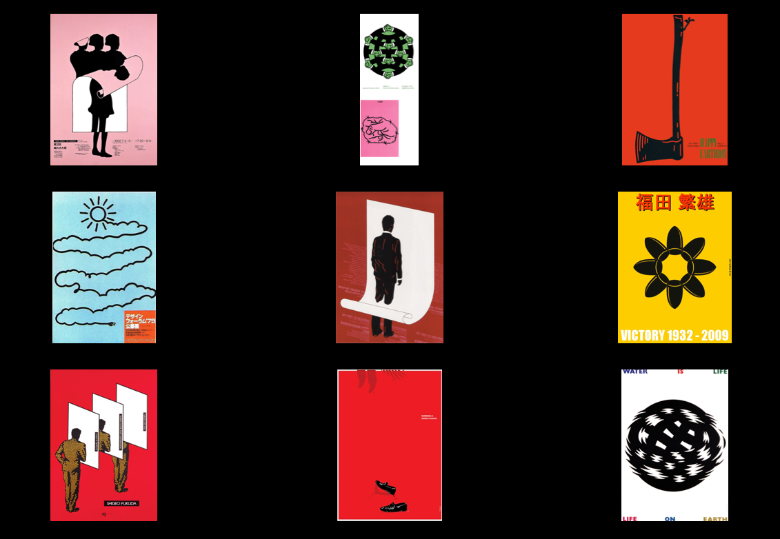
Some visual examples taken into the tutorial:
Work by iconic Japanese designer Shigeo Fukuda, who I felt had a lot of socially conscious work regarding war.
Issues discussed in tutorial:
World design conference in Tokyo 1960
Shigeo Fukuda
In what ways was Japanese modernism distinct from European modernism?
How does Japanese modernism reflect the unique native particularities of Japanese culture?
Research:
Interational typographic style. Books on modernism - Graphic Design: Reproduction and Representation by Jobling and Crowley
Gurafiku blog on different decades of Japanese design
Student action
Consider what the practical side of the project is going to be too.
///
Moving forward I think it's best to look into the core concepts of modernism, and how history brought about the era of modernism and then look into Japanese history and apply the same principles of modernism too it and investigate how/if Japanese design is notably different from modernism throughout Europe and the rest of the world, in visuals, concepts and messages communicated.
Saturday, 1 December 2012
D&AD: Emporio Armani Fall/Winter 2013 Lookbook
Posted on 11:58 by cena
I found the photography and visual design in this look-book quite eye-catching and relevant as it seems to be adopting a Japanese aesthetic style and backdrop.
Life's A Pitch: Branding
Posted on 10:16 by cena
We're working on branding Asssk. our design agency for our Life's A Pitch brief. We want to have all feasible material branded as best as we can so our overall identity is on point and consistent.
I've found some useful examples which I feel will help us and give some pointers about what's already out there and whether we could feasibly need the stuff in our day-to-day tasks.
Matthew Hancock. Double sided business cards, some sort of memo/note book for each of us at Asssk would be sweet. The tied fastening on the envelope almost perfectly lends itself to the central S in our logo, there's definitely something there!
The Argonaut. Envelope sizes also need to be considered, C5/C4 and DL sizes are what we're leaning towards right now, each one having different uses. Screenprinted/debossed notebooks with our logo would add a really tactile and finished appeal to the notebooks.
Branding for Horst. Inked stamps and die-cut envelopes?
Passport Design. The branding is consistent and I like the folder in the bottom photo, could be used for important documents when going to meetings, such as contracts to sign, notes etc.
The simplicity of these cards works really well, the choice of stock with one colour ink + spot varnish would really set it off
Subscribe to:
Posts (Atom)


.jpg)


.jpg)


.jpg)