Maybe this could work quite well, as it sort of makes you think. The things we take for granted all haven't existed forever, the problem needed to be there for them to be invented somewhat unknowingly sometimes.
e.g.
In 1895 - Agitated by a customer repeatedly
sending his fried potatoes back saying
they were too thick and soggy,
Chef George Crum decided to slice
the potatoes as thin as possible until
they were crisp and seasoned them with salt.
These are now what you call crisps.
-x-
Difficult situations inspire ingenious solutions
In 1905, Frank Epperson accidentally left his soda outside in the cold. It froze overnight with his stirring stick still inside. This is how popsicles were invented.
-x-
Necessity is the mother of invention
Alexander Fleming didn't clean up his workstation before going on vacation one day in 1928. When he came back, Fleming noticed that there was a strange fungus on some of his cultures. Even stranger was that bacteria didn't seem to thrive near those cultures. Penicillin is now one of the most widely used antibiotics in the world
-x-
Necessity is the mother of invention
Maybe? I'll try this out, it won't work with the ribbon idea though, With the amount of text, it might just have to be simplified to allow more room for the text. I think some work better with the 'necessity' proverb, instead of my interpretation.
Some sources http://popularemails.com/accidentalinventions.htm
The original quote I'm working from is "Necessity is the mother of invention" So maybe I should look at inventors/inventions and maybe how I could incorporate these into the poster(s)
Einstein is obviously a global and historical icon and instantly recognisable. I think he would work well "necessity is the mother of invention", I'm not sure he would work with "Difficult situations inspire ingenious solutions" as it doesn't involve the word 'invent'. Maybe that's just me though
Here's quite a varied assortment of photos that could work with the proverb overlayed on top
This could work well. Everyone pretty much knows who/what this is and what it signifies. A tought situation like a world cup final turned into a very good solution and outcome.
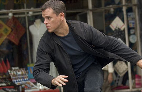
As part of the imagery aspect of my brief, I like the idea of adding references to films, through iconography or film stills. I'm trying to remember and find famous and instantly recognisable moments from films where the hero/villian was in a difficult situation, but came up with an ingenious solution. Geddit!
Don't want the films to be too obscure, so these are the moments/movies I found which are what I was looking for. Remains to be seen how/if I'll implement this idea on my finals though.
I can see it maybe working as a greyscaled/halftone picture in the background with my text and composition on top in, maybe, white or something. The poster is 2:1 A3 format so is quite narrow and long so dunno if all the information of the picture will be effectively communicated on a canvas that narrow.
The Bourne Ultimatum
DIFFICULT SITUATIONS INSPIRE INGENIOUS SOLUTIONS
Kill Bill Vol. 1
She's definitely in need of an ingenious solution, in this difficult situation.
Some nice ones I straightaway thought of, and some that I found. They all take a very different approach but have the same general purpose. Maybe I can take a similar approach as my purpose is also to inspire/advise/motivate
Nothing Past, Nothing Future by Matt Chase
Really like the way he's cleverly combined imagery and metaphors you subtly recognise, with the words. For example, the "Future" text, looks like it's really moving and heading 'into the future'. This looks really nice and clean, a look that I find myself going for with my poster so it's relevant. Really like the way he's signed it in the corner too, with the sort of embossed badge thing. I don't know if I'll have time to do any fancy production method like that but I could definitely sign it with a little badge in the corner. Definitely something to think about.
A is for rebel
Again, this is quite smart, yet quite clean and easy on the eyes too. I really like just keeping it simple with simple one tone graphics on stock. In both these cases - black. I think my own work, if I kept a similar style would look quite nice on some nice cartridge stock, or sugar paper.
by Alida Rosie Sayer
This is a very interesting effect, It's probably handmade and then photographed. Again, time is not on my side, otherwise I would have loved to do something like this. I think this brief is also an exercise in making decisions and quick so this is something I need to keep in mind, although I really like this.
By Oli Phillips
Ahh. Something quite similar to my initial poster idea. I guess nothings new nowadays! I like the way he's got the ribbons beginning and end sections going off to the side. They're not as long as mine and it leaves space at the top and bottom, an issue I had with mine. If I add pictograms, where will they go? So I think this might be a good solution for my own work.
Creativity by Marius Roosendaal
Nothing wrong with keeping it simple. I think this is the look I want to go for, again I've only got a couple of days to wrap everything up, so simple and not fussy is the way to go I think. I like the way the author of the quote is referenced at the bottom. I'm the author of my quote, maybe I can sign it with my own name? That's an idea. Might also add a little lighthearted touch to it aswell.
Keep Calm and Carry On by the British Government in 1939
Couldn't miss this out, could I? Again, very clean and precise. Choice of type is obviously very, very, important with any design work, but more so with work of this simplicity. Another thing to keep in mind.
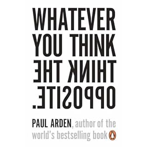
Paul Arden has many motivational books. Again in this example, clever solutions.
Very good books actually. Again, layout, type, colour choice, all work together.
This kind of stuff is also really big on the internet. Known as "motivational posters" Most students will probably be aware of them so a play on this could be useful. Although I don't see a chance for much creative graphic design, taking this route. It's meant purposely to look shabby!
As part of my one week brief for 403, I obviously need to do some research. After abit of indepth jabbering to myself (check DP thread!). This is the summary of what I need to generally research into, hopefully it will spark something off in my brain.
Main points to research
Motivational Posters
Layouts + Composition
Film Scenes
Famous inventors
Famous inventions/solutions we take for granted
Origins of said inventions/solutions
Colour psychology and colour pallettes
Origins of the quote - Plato?
Definition of the individual words in quote
My own versions of the quote to make it more relevant maybe
What typeface to use, maybe look into this more once you've decided abit more about what icons/direction to take
Make some quick knock-ups and see where you go (only till Thursday/Friday to get this done)