Another really interesting article on Design Observer
"Hitler commissioned a book titled Das Politische Plakat: Eine Psychologische Betrachtung by Erwin Schockel (Franz Eher Verlag, published in 1939), a psychological assesment of English, American, French, Russian and German political posters. It was a handbook for German propagandists and others. "
Hitler’s Poster Handbook
Hitler’s fervent desire to attain propaganda supremacy among nations was a direct result of the German defeat in World War I and his belief that superior allied propaganda trumpedKaiser Wilhelm II’s meager output. Through intensive barrages of posters and other visual media, Britian and America effectively defamed the “Hun” in the eyes of the world, portraying the Kaiser’s military as callous blood-thirsty beasts. The German counterattack was tepid at best. “The Germans were sent into this mighty battle with not so much as a single slogan,” wrote Eugen Hadamovsky, the Nazi propaganda expert and Josef Goebbels’ deputy, in Propaganda and National Power (1933, reprinted by Arno Press in 1972). So when the Nazis came to power, Hitler commissioned a book titled Das Politische Plakat: Eine Psychologische Betrachtung by Erwin Schockel (Franz Eher Verlag, published in 1939), a psychological assesment of English, American, French, Russian and German political posters. It was a handbook for German propagandists and others.
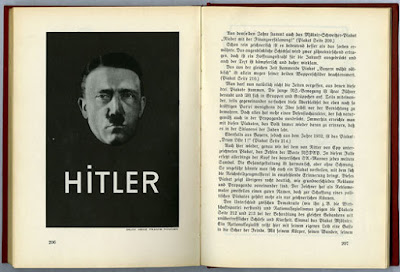
Das Politische Plakat: Eine Psychologische Betrachtung (The Political Poster: A Psychological Review), by Erwin Schockel
Schockel stridently addressed questions of success and failure. The section on historical performance viewed posters through the long lens from ancient times to the rise of the Nazis, always comparing and contrasting national styles and vocabularies. A chapter on the language of war posters revealed the benign and malicious and the results of each. Schockel, who served in an art directorial role for the propaganda wing of the party, further discussed the application of future war missives, internal political developments, the role of posters in altering opinion, and how individual parties developed distinct signs and symbols. He ended the book with a critical comparison of good and bad posters. And as was de rigeur in Nazi handbooks, derision of Jews — in this case, Jewish graphic artists — was also cited.
Das Politische Plakat was one in a series of textbooks and manuals issued through the Reichspropagandaleitung, based in Munich (Reich Propaganda Office of the Nazi Party, a separate department from the more powerful Berlin-based Ministry of Propaganda and Enlightenment) for use by party members only. Schockel’s message was clear: powerful propagandistic graphics must be simple and memorable. He highlights one Nazi poster in particular. A 1932 election poster so minimalist that it could easily be confused with Modernist design, featured a black and white floating silhouette of Hitler’s face (just the head) against black. A rather hypnotic gaze — the forerunner of the ubiquitiouis “big brother” trope — was focused on the viewer. “Hitler” was set in white sans-serif capital letters, with only one typographical tic — a square over the “I” in the name (perhaps a visual pun on his famously cropped mustache).
“The calmness, goodness and strength that radiate from Hilter’s face communicate themselves to the observer,” wrote the sycophantic Schockel. “The impression it makes on people of unspoilt mind must be powerful.” Lastly, he notes “In addition, we had the poster printed on a black background which at the time served as an eyecatcher in the midst of the otherwise garish colors of advertising pillars.” After World War I nothing was left to chance.


0 comments:
Post a Comment