I like aspects of each and I think I can combine bits from each in order to create an effective phonebook you'd want to keep and use
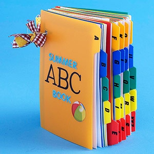
This tabbed approach to indexing is really useful and effective. Instead of looking at a table of contents and skimming through the book to the find the page, you can literally jump right to the right section with your thumb which is really useful for a phone book.
The embossed finish on this is subtle and very sleek, it suits the luxurious feel and style of the memo book. Embossing or a finishing process would also be very relevant for my own project, it's a small touch but I've always remembered Field Note's books for their rounded corners. It adds a nice aura to the book and subconsciously kind of makes you want to open it and use it, or maybe it's just me...
This memo pad is a 'daihukutyo' a Japanese old style account book.The binding method used for the book is interesting and adds a different element to the product. A vertical phonebook is a possibility.
This kind of simple layout within the pages of the book would be ideal. A no-nonsense straight to the point approach with the appropriate tab letting you know what section you're in.
Colour guide book.
Bright stocks for covers are definitely eye catching and work well with a one colour print, especially black. Could very easily be foiled or varnished too for an extra tactile feel.


0 comments:
Post a Comment