a mushtaq

  • Subscribe to our RSS feed.
  • Twitter
  • StumbleUpon
  • Reddit
  • Facebook
  • Digg

Tuesday, 19 February 2013

Bushido: Posters and Format

Posted on 11:02 by cena
For now all my research is secondary but I plan on scouting around for some actual Japanese prints and examine the stock choice and general feel and size of the posters so I can take similar considerations for my own work.

Posters are a substantial part of this project, as they're a creative interest and ambition of mine but I don't   want to just do posters as that isn't suitable.


Japanese Graphic Design is something I plan on looking into deeply and combining with my own design style to create something relevant and creative for the subject. Here are some I feel inspired by:


These would all work really well in terms of screen-print, the bottom two probably definitely are, I plan to use this brief as an opportunity to explore screen-print further and it's also very relevant, digitally printed posters go against the traditional and spiritual vibe of Martial Arts culture.


Traditional Japanese prints

I feel really inspired and personally in terms of my creative interest Japanese traditional prints and graphic design from the 50's and 60's onwards still remain relatively similar with emphasis on layering colour and working with colour economically and effectively. The colours come across vibrant and efficient.

Woodblock prints. This is definitely a format and print process to look into, woodblock printing is an area I've not explored and this could be a chance to, especially in terms of luxurious and protective stock.


Layering elements and colour screens.


Process?

Excerpts from: http://en.wikipedia.org/wiki/Japanese_art

Until modern times, the Japanese wrote with a brush rather than a pen, and their familiarity with brush techniques has made them particularly sensitive to the values and aesthetics of painting.


With the rise of popular culture in the Edo period, a style of woodblock prints called ukiyo-e became a major art form and its techniques were fine tuned to produce colorful prints of everything from daily news to schoolbooks.


Art of the Edo period

"Fūjin and Raijin" by Tawaraya Sōtatsu
The Tokugawa shogunate gained undisputed control of the government in 1603 with a commitment to bring peace and economic and political stability to the country; in large measure it was successful. The shogunate survived until 1867, when it was forced to capitulate because of its failure to deal with pressure from Western nations to open the country to foreign trade. One of the dominant themes in the Edo period was the repressive policies of the shogunate and the attempts of artists to escape these strictures. The foremost of these was the closing of the country to foreigners and the accoutrements of their cultures, and the imposition of strict codes of behavior affecting every aspect of life, the clothes one wore, the person one married, and the activities one could or should not pursue.
In the early years of the Edo period, however, the full impact of Tokugawa policies had not yet been felt, and some of Japan's finest expressions in architecture and painting were produced: Katsura Palace in Kyoto and the paintings of Tawaraya Sōtatsu, pioneer of the Rimpa school.
Circuit style Japanese garden: Koraku-en Garden in Okayama, completed in 1700
Architecture: Katsura Detached Palace, built in imitation of Genji's palace, contains a cluster of shoin buildings that combine elements of classic Japanese architecture with innovative restatements. The whole complex is surrounded by a beautiful garden with paths for walking. Many of powerful Daimyo (feudal lords) built a Circuit style Japanese garden in the territory country, and competed for the beauty.
Painting: Sōtatsu evolved a superb decorative style by re-creating themes from classical literature, using brilliantly colored figures and motifs from the natural world set against gold-leaf backgrounds. One of his finest works is the pair of screens The Waves at Matsushima in the Freer Gallery in Washington, D.C. A century later, Korin reworked Sōtatsu's style and created visually gorgeous works uniquely his own. Perhaps his finest are the screen paintings of red and white plum blossoms.
Sculpture The Buddhist monk Enkū carved 120,000 Buddhist images in a rough, individual style.
Woodblock prints and Bunjinga: The school of art best known in the West is that of the ukiyo-e paintings and woodblock prints of the demimonde, the world of the kabuki theater and the brothel district. Ukiyo-e prints began to be produced in the late 17th century, but in 1764 Harunobu produced the first polychrome print. Print designers of the next generation, including Torii Kiyonaga and Utamaro, created elegant and sometimes insightful depictions of courtesans.
The print Red Fuji from Hokusai's series, Thirty-six Views of Mount Fuji.
In the 19th century the dominant figure was Hiroshige, a creator of romantic and somewhat sentimental landscape prints. The odd angles and shapes through which Hiroshige often viewed landscape, and the work of Kiyonaga and Utamaro, with its emphasis on flat planes and strong linear outlines, had a profound impact on such Western artists as Edgar Degas and Vincent van Gogh. Via artworks held in Western museums, these same printmakers would later exert a powerful influence on the imagery and aesthetic approaches used by earlyModernist poets such as Ezra Pound, Richard Aldington and H.D..[10]
Another school of painting contemporary with ukiyo-e was Bunjinga, a style based on paintings executed by Chinese scholar-painters. Just as ukiyo-e artists chose to depict figures from life outside the strictures of the Tokugawa shogunate, Bunjin artists turned to Chinese culture. The exemplars of this style are Ike no Taiga, Yosa Buson, Tanomura Chikuden, and Yamamoto Baiitsu.


The main forms of traditional japanese print is definitely sculpture, painting, woodblock printing and calligraphy, so in terms of mass production calligraphy might be a bit far-fetched but in terms of printing in layers, screen-printing and woodblock printing is a definite avenue to take.


Contemporary Relevant Poster design


Studio FNT are a huge inspiration of mine and their experimental take on layering image and type is definitely the kind of work I want to be producing and feel myself slowly starting to become involved with but want to practice more and put into my portfolio. Studio FNT are a Korean based design studio specialising in promotional and editorial design.


Read More
Posted in OUGD505 | No comments

Sunday, 17 February 2013

Windows 8: The Boldest, Biggest Redesign In Microsoft’s History

Posted on 16:20 by cena
Microsoft has received pretty unanimous praise for its synchronisation between UI's, and mobile, to tablet to desktop. It's UI ditches old elements such as a desktop in favour of a fully digital METRO design. no bevels and leather textures, it's all sharp lines and grids and I feel this is definitely the way forward for the BBC rebrand and the industry opinion is on the digital side too.

The grid like design and type almost extends across Bauhaus like print sensibilities which is one of our aims with this BBC redesign.


/////////////////

Windows 8: The Boldest, Biggest Redesign In Microsoft’s History

GOOD DESIGN IS GOOD BUSINESS
THIS FALL, A BILLION PC USERS WILL WAKE UP TO A NEW DESKTOP--WINDOWS 8. COULD IT SIGNAL A DESIGN REVOLUTION AT MICROSOFT?


A pair of leggy, lipsticked models stop short outside a casting call at Milk Studios, a cavernous space in Hollywood known for art shows and photo shoots. They edge forward in 4-inch heels, intrigued by the sidewalk scene: a snaking line of balding reporters and backpacked bloggers sweating in the June afternoon heat. Not exactly the red carpet at Fashion Week. "It’s for Microsoft," an attendee mumbles when asked about the commotion. Thick-framed Ray-Bans do nothing to hide the models’ puzzled looks.

A good 40 minutes after the crowd began to form, the doors open and more than a hundred reporters shuffle into the space and take their seats. The room darkens, the caffeinated stares of live-bloggers lit only by the glow of MacBook Airs. (Not for crew members, who joke that their instructions are "No fruit allowed"; Microsoft higher-ups had forbidden them from bringing iGadgets to the event.) A bass-heavy pop song blasts over the speakers as CEO Steve Ballmer stomps out in front of the crowd, his Shrek-like stature dominating the stage, to unveil the star of the show: the Surface tablet, the first PC device that Microsoft has manufactured in its 30-year history.

In the center is Sam Moreau, who led the Windows user experience team.
The buzz, the secrecy, the horde of reporters--one might expect this from Apple, not the corporate giant responsible for Clippy and blue screens of death. The attention was warranted, too. The Surface, with its ultrathin magnesium casing and integrated kickstand, might be the iPad’s most compelling competitor yet.

But what was really revolutionary at Milk Studios that day was the software driving the Surface: Windows 8, which aims to change the way we’ve been interacting with computers for the past three decades. Windows 8 could also transform the nature of the software giant’s competition with home-run king Apple, potentially reversing a string of embarrassing defeats, especially in the mobile market. Even more improbably, Microsoft is building this comeback attempt not on its traditional strength--engineering--but on, of all things, design.

IT’S NOT ABOUT ADORNMENTS. IT’S ABOUT TYPOGRAPHY, COLOR, MOTION. THAT’S THE PIXEL.
Microsoft has united around a set of design principles that it dubbed Metro, a slick, intuitive, and playful visual language that is seeping into the company’s product portfolio, from Office to Bing to Windows Phone to Xbox, creating a common platform for hardware of all types. You won’t be seeing the word Metro in Microsoft’s branding because of a reported last-minute naming conflict with a European partner. But as manifested in Windows 8, these principles embody what the company has called an "authentically digital" experience. Gone are the icon-studded toolbars and drop-down menus and artificial glassy reflections; Windows 8 emphasizes a stripped-down user interface that’s flat and without flourish. "It’s not about adornments," says Sam Moreau, the director of user experience for Windows. "It’s about typography, color, motion. That’s the pixel."

NOTE
The Innovation by Design Awards on October 16 will celebrate the controversial ideas, new products, business ventures, and wild ideas highlighted every day on Co.Design. Award Winners in nine categories will be unveiled at the event. Register today.


With 1 billion users of its operating system, Microsoft’s novel approach to interface design could cause tectonic shifts in the way software of all sorts is conceived. And therein lies the risk. Windows has long been Microsoft’s bread and butter: 336 million Windows PCs were sold in 2011--roughly 10 per second--a large chunk of which went to corporate customers, who are constitutionally resistant to change. The Surface could add to the disruption, as third-party hardware makers will soon be in the awkward position of having to compete with the company they support. But Microsoft has no choice other than to bet on its new software design. For if Apple has proved anything, it’s that design has become big business in the technology world.

"It’s the ultimate design challenge," Moreau says. "You’ve got 25 years of Windows behind you. There’s a responsibility to preserve it but also to evolve--knowing that when you change something, you’re changing how computing works."

Live tiles display real-time updates for email, weather, and more, giving immediate context without having to dive into a web page or widget.
Visually, at least, Windows 8 is the simplest version of the operating system ever. For years, software has followed the same formula: The user interface mimics a real-life desktop, with documents filed in folders and pictographic icons that act as visual metaphors of a software program’s function. It’s a legacy of the graphical user interface (GUI) popularized in the 1980s by Apple. Operating systems have largely seen only incremental innovations since Windows 1.0 and the original Macintosh. They do many more tricks than before, but the underlying blueprint is the same.

METRO HAS A NOBLE PROVENANCE: THE BAUHAUS SCHOOL, THE GERMAN MODERNIST MOVEMENT OF THE 1920S AND 1930S.
Windows 8 rips that blueprint to shreds. The new face of Windows is a Mondrianesque grid of tiles colored like Skittles. Clicking on a tile will bring up your news or your inbox or your documents. Within these Metro-style apps are no toolbars or framed windows--just an immersive full-screen experience. The UI is minimal, featuring only clean typography, basic icons, and intermittent animations that provide real-time updates for, say, a new email or calendar appointment. Even the famous start button--the icon occupying the lower left corner since Windows 95--is gone. (Users can still access the old desktop-based UI if they wish, but it’s been relegated to an application within Windows 8.)

Metro has a noble provenance: the Bauhaus school, the German modernist movement of the 1920s and 1930s. Its central ethos was that materials must be treated in ways that speak to their essential nature. "Reducing down to the most beautiful form and function--that’s what the Bauhaus was all about," Moreau says. Fashioning metal to look like wood, for example, was tantamount to a crime. These standards have driven architects and graphic designers ever since.

The Bauhaus ideal came to permeate life in all sorts of everyday objects--chairs, lamps, teapots--and by the 1960s, utilitarian design was helping passengers navigate city streets, highways, and transit hubs. Indeed, the language of Metro was initially sparked by way-finding systems in subways and airports. Jeff Fong, principal design lead for Windows Phone and a founder of the Metro principles, cites among his inspirations the signage at Heathrow’s 1961 Oceanic Terminal (now Terminal 3) for its crisp typography and no-fuss iconography, and Italian designer Massimo Vignelli’s 1972 New York City subway map. "That structure, that order, that grid system--there’s something so clear and direct about it," he says of the lucidity of both. "Before we called it Metro, we actually called it Airport."


EDITOR’S NOTE
For a harsh critique of Apple’s reliance on skeuomorphism, voiced by former Apple designers, click here.


As in Bauhaus design, with its fidelity to the essence of materials, the most innovative element of Metro is its shift away from visual metaphors. That imitative system, called skeuomorphism, is another legacy of GUI. Before users were accustomed to working with computers, designers had to make on-screen applications legible--for example, a digital Rolodex to denote where contacts were stored. Skeuomorphism has since flooded into all areas of UI design--most prevalently (and jarringly, to some) in Apple’s software, where digital calendars have faux-leather stitching and bookshelves an Ikea-like veneer. "We think stuff like leather stitching is just a useless distraction," says Moreau, who seems genuinely repulsed by excessive GUI, as if it were actually gooey and not just pronounced that way. Team Microsoft believes consumers have developed a fluency for digital interfaces and no longer need those kitschy translations. In Bauhaus-speak, software designers can finally let the pixel be a pixel.

That Microsoft would come to invoke the Bauhaus is an unlikely turn of events. The impetus isn’t coming from a Ministry of Design or an aesthetics-obsessed CEO. "Unlike other companies that maybe have one person at the top, we don’t have a [design] czar at Microsoft," says Julie Larson-Green, VP of program management for Windows. Of Metro, she adds, "It’s not like Steve [Ballmer] decreed it." One former longtime Microsoft manager put it bluntly: "I don’t think Steve could even spell the word design." And unlike Steve Jobs, who was infamous for meddling in every detail of Apple’s product launches, Ballmer didn’t go to any of the rehearsals at Milk Studios for the unveiling of the Surface; his part was played by a stand-in till he arrived on the day.

So if the brass were so indifferent to design, how did this thinking emerge at Microsoft at all?

In May 2009, Julie Larson-Green corralled 150 thought leaders from various Microsoft groups (Office, Phone, Bing, Xbox) in the Redmond, Washington, campus conference center to kick off planning for Windows 8. MC Hammer’s "2 Legit 2 Quit" boomed throughout the auditorium, and the crowd watched as Sam Moreau and fellow Windows designer Jensen Harris rifled through then-and-now pictures of Jodie Foster. They wanted to demonstrate how much the world had changed since 1992, when baggy pants and The Silence of the Lambs were in and the first memo circulated at Microsoft about a new kind of UI that would go into Windows 95.

The new social app corrals your fragmented networks--Facebook, Twitter, LinkedIn--into one simple hub of status updates.

But the PowerPoint presentation took a serious turn when Moreau and Harris, self-described partners in crime, began displaying images of revolutionary products followed by their disruptive successors: Sony’s PlayStation 2 controller replaced by Nintendo’s Wii remote, Yahoo’s home page supplanted by Google’s search box. They didn’t want to wait for Windows to be shunted aside. As Larson-Green says, "It’s a risk to do something new, but it’s also a risk to sit where we are. There’s always an opportunity to think different."
SO IF THE BRASS WERE SO INDIFFERENT TO DESIGN, HOW DID THIS THINKING EMERGE AT MICROSOFT AT ALL?
Call it a Freudian slip that Larson-Green would invoke Apple’s famous slogan to describe the innovator’s dilemma faced by Microsoft. If anything, the warning came late; the company had already become the complacent incumbent and fallen behind in music players, e-readers, and smartphones. The PowerPoint presentation did include a slide for the iPhone (conveniently compared to a BlackBerry), the perfect symbol of the disruption Microsoft suffered in mobile operating systems, where it once owned a 42% market share. Apple’s iPad now generates more revenue than Windows does; iPhone sales alone eclipsed Microsoft’s total revenue of about $74 billion for the fiscal year ending in June.

So Microsoft embraced design not because Ballmer suddenly discovered beauty or started futzing around with typefaces, but because Apple showed that good design can be obscenely profitable. "We have recognized the value of [design]," says P.J. Hough, head of Microsoft’s Office division, "and we have decided to make it a much higher priority." A former senior-level Microsoft source who advised Ballmer puts it a touch more tartly: "They’re placing an emphasis on design because the dollars sit there. They’re looking at Apple’s market cap."

Still, the Windows 8 designers can’t quite pinpoint the origins of the company’s new religion, not least because they have worked without attention from top management. According to insiders, Ballmer offered no direction to the Windows 8 team on the features of the new user interface. Windows president Steven Sinofsky kept him abreast of the team’s progress, but Ballmer met with Larson-Green only twice during the development process, and he never got together with the team to green-light the design.

Now, after a long, hard slog, the company’s top designers have a wider field of play. At 41, Moreau is young for Microsoft’s leadership team; he joined the company only in 2006. ("Internally, that’s code for 'Vista isn’t my fault,' " he has joked.) With a boyish grin, he speaks eagerly but unpretentiously about Swiss graphic design and Josef Mueller-Brockmann, its exemplar; you imagine the documentary Helvetica sitting atop his Netflix queue. Moreau has teamed up with veterans such as Windows Phone SVP Joe Belfiore, who joined Microsoft in 1990 as an engineer, to provide downfield blocking for designers. Sources praise the pair for "lowering barriers" and "putting a lot on the line and really battling with management."

Their work has let Microsoft steal a beat on Apple, winning the company some unfamiliar praise. "I think Microsoft is ahead of everyone else," argues Gadi Amit, founder of design agency NewDealDesign. "They’re no longer chasing Apple; they’re actually making Apple look old. That’s a really unexpected turn of events in design and the competition between these two powerhouses."

Microsoft and Apple have long been at odds over software design. If any company has exemplified skeuomorphism, it’s Apple. As Microsoft flattens its interface, Apple continues to push its software toward more glossiness, more 3-D, more bevel. Apple recently demonstrated a feature in iOS 6, the next version of its mobile operating system, that will delete used e-tickets and coupons with an animated paper shredder.

Inside Apple, tension has built up between supporters and detractors of these digital trompe l’oeils. Scott Forstall, Apple’s SVP of iOS, is a big supporter of the skeuomorphic approach. But industrial design SVP Jonathan Ive and other top Apple staff are said to despise the trend, according to several former senior Apple designers who wished not to be identified. "You could tell who did the product based on how much glitz was in the UI," says one source familiar with Apple’s design process.

One former senior UI designer who worked closely with Jobs traces skeuomorphism back to the Apple cofounder himself. "Steve pushed it hard," the source says. "The iCal’s leather stitching was taken directly from a texture in his Gulfstream jet. There was lots of internal email among UI designers at Apple saying this was just embarrassing, just terrible." Apple declined to comment for this story.

Much of the criticism of Apple’s software design hasn’t made its way into the mainstream consciousness partly because, as industrial designer Yves Behar puts it, "People think that everything Apple does is sent from God." But its software, once as widely praised for its polish as Microsoft’s was (and still is) derided for its glitches, clunkiness, and vulnerability to malware, now faces a legitimate rival in Windows. "My teenage daughter has never seen some of these GUI metaphors," says Amit. "She doesn’t use a Rolodex or the calendar my grandmother used 50 years ago. Microsoft finally broke through this paradigm."

Behar agrees and is surprised that Apple, so renowned for its Bauhaus approach to hardware and the beauty of its devices, would tolerate such embellishments in its software. "It’s distasteful because it’s inherently confusing," he says. "The digital bookshelf doesn’t really work like a bookshelf. Microsoft is showing the way to higher, cleaner, more functional design."


Even so, it may be too early to declare that Microsoft has turned over a new leaf, especially in terms of commitment from its leadership. "If the importance and value and DNA of design aren’t trickling down, they sure as hell are going to have a hard time trickling up," says Ian Sands, the former senior director of Microsoft’s product long-term vision and strategy, who left the company in 2010. Louis Danziger, an independent graphic designer who has consulted with Microsoft since 1995 and taught many of its top designers, also has doubts. "The software engineers and product managers there often think of design as lipstick," he writes via email, "something applied at the end to enhance appearance rather than an enabler of their activity, which it is."

NO MATTER HOW LOVELY THE NEW FACE OF WINDOWS 8, THE SUSPICION IS THAT THE OLD MICROSOFT IS HIDDEN ONE LAYER BENEATH.
At Apple, by contrast, design is embedded in the culture. One former top designer who has worked at both Apple and Microsoft recalls visiting the Apple shipping unit and discovering workers carefully loading boxes so the logos all faced the same direction. "I asked why and one guy explained that he loved the look on people’s faces when he threw open the truck doors and revealed all the boxes perfectly aligned," the director says. "They weren’t instructed to do that. I know that’s just a simple example, but I mean, it’s the guys in shipping and receiving!"

It was 2010 when Moreau and Larson-Green laid eyes on the first mock-up of Windows 8, named "Pocahontas" to reflect their journey into a new world of design. Since then, Metro has worked its way into other products and software applications. The Xbox features a dashboard of tiles branded with modern typography. Bing touts a Spartan design that fuses social networking with search. And in the next version of Office, blue, green, and red ribbons will slide out from the left side of Word, Excel, and PowerPoint when users, say, print or save a document, providing a simplified interface for navigation. Most menus will seamlessly refresh rather than disgorge clunky pop-up boxes, and all files will be stored in the cloud by default. Much of the clutter will be gone--fewer buttons, no drop shadows--and, like Windows 8, Office will be touch-screen ready.

On October 26, Microsoft will release Windows 8 to the world, and the company will finally learn if its bet on design has paid off. Microsoft knows that it faces a stern test in the market, especially with corporate customers, for whom elegant design has never been a decisive factor, as Apple could tell you. But whether or not users love Windows 8, Moreau and his team have done something new; they have taken it to Apple; they have won a little respect.

And yet… inside Windows 8, past its novel and beautiful skin, lie many elements of the past. Just one click away, in the desktop app, is the old world of Microsoft--toolbars, task bars, drop-down menus, cluttered folder systems. Even the company’s flagship browser, Internet Explorer, once a key to Microsoft’s future on the web, remains a symbol for the addiction to this bygone era. Two versions of Explorer come installed on Windows 8, one pre- and one post-Metro. No matter how lovely the new face of Windows 8, the suspicion is that the old Microsoft is hidden one layer beneath--all you have to do is scratch the surface.

In late March, I spoke with Moreau about this legacy on a visit to Soho House, a pricey, members-only club in Manhattan’s meatpacking district. In the fifth-floor library, framed by elements he banished from Windows--leather-bound books, wood paneling--I asked him whether Windows would ever be free of all the cobwebs.

"I have no idea," he says, swirling the ice in his glass. "We haven’t even started thinking about what’s after this. It’s enough just to build this thing." He adds, "It’s true that people don’t like change. But we don’t do things frivolously. I don’t want someone to be frustrated or mad--that hurts my heart."

And who knew Microsoft had a heart?

A version of this article appears in the October 2012 issue of Fast Company.


Read More
Posted in OUGD503 | No comments

Will Apple’s Tacky Software-Design Philosophy Cause A Revolt?

Posted on 16:07 by cena
It's interesting to read existing views such as this article about Skeumorphism in UI and web design this is I,portent for us to consider or stay away from as nowadays everyone is a smartphone and web user and everyone has an opinion, Skeumorphism in my opinion is a dying out trend and purely digital is the way forward.

///////////////

Will Apple’s Tacky Software-Design Philosophy Cause A Revolt?

FAST COMPANY'S AUSTIN CARR SPEAKS WITH INDUSTRY INSIDERS AND EX-APPLE DESIGNERS WHO HAVE SOURED ON THE FAKE LEATHER, GLASS, AND WOOD THAT RUNS THROUGH OS X AND IOS.


By now it’s almost inevitable given the company’s track record: No matter what Apple unveils tomorrow at the Yerba Buena Center (an iPad Mini? iPhone 5?), pundits will herald the company for its innovative thinking and bold hardware design. But the elephant in the room will be Apple’s software, which many inside the company believe has evolved for the worse in the last few years.

EDITOR’S NOTE
Click here for our feature on the redesign of Windows.

Despite consistently glowing reviews from critics and consumers alike, iOS and OS X, Apple’s operating systems which tie Macs and iPads and iPhones together, have rubbed some the wrong way in recent years with their design directions. During my reporting for Fast Company's feature on design at Microsoft, which was part of our October design issue, I spoke with a number of designers, Apple veterans, and industry insiders hostile towards Apple’s approach to software design. Equally eye opening was the number who genuinely praise Microsoft for its novel approach for Windows 8, the most radical redesign to date of the world’s most ubiquitous operating system. The criticism and controversy, much of it revolving around a trend called skeuomorphism, reveal chinks in Apple’s armor rarely visible to those outside One Infinite Loop.


"VISUAL MASTURBATION"
What’s skeuomorphism? If you’ve ever used an Apple product, you’ve experienced digital skeuomorphic design: calendars with faux leather-stitching, bookshelves with wood veneers, fake glass and paper and brushed chrome. Skeuomorphism is a catch-all term for when objects retain ornamental elements of past, derivative iterations--elements that are no longer necessary to the current objects’ functions.

ICAL’S LEATHER-STITCHING WAS BASED ON A TEXTURE IN JOBS’S GULFSTREAM JET.
In software, skeuomorphism can be traced back to the visual metaphors designers created to translate on-screen applications before users were accustomed to interacting with computer software: virtual folders to store your documents, virtual Rolodexes to store contacts. But over time, skeuomorphism has seeped into all areas of UI design, especially in Apple’s software, where text documents, for example, are made to look like yellow legal pads.

"It’s visual masturbation," says one former senior UI designer at Apple who worked closely with Steve Jobs. "It’s like the designers are flexing their muscles to show you how good of a visual rendering they can do of a physical object. Who cares?"

Inside Apple, tension has brewed for years over the issue. Apple iOS SVP Scott Forstall is said to push for skeuomorphic design, while industrial designer Jony Ive and other Apple higher-ups are said to oppose the direction. "You could tell who did the product based on how much glitz was in the UI," says one source intimately familiar with Apple’s design process.

But before Forstall, it was Steve Jobs who encouraged the skeuomorphic approach, some say. "iCal’s leather-stitching was literally based on a texture in his Gulfstream jet," says the former senior UI designer. "There was lots of internal email among UI designers at Apple saying this was just embarrassing, just terrible."

YOU COULD TELL WHO DID THE PRODUCT BASED ON HOW MUCH GLITZ WAS IN THE UI.
Perhaps the most infamous culprit of this design direction is Apple’s Game Center, the social-gaming app that’s dressed in a lacquered wood and green felt that lends it the feel of a casino. "Steve pushed very hard to have everything--the felt-cloth table, the game chips--look like they would in real life," says another former Apple designer. "Internally, a lot of people were shocked by the richness. Many think it’s gone too far."


WHY IS SKEUOMORPHISM BAD?
Some may wonder why designers would harbor such harsh feelings toward seemingly minor flourishes in UI design. But at Apple, where pixel-perfect standards are the norm, many designers believe skeuomorphism has significantly degraded the user experience.

The issue is two-fold: first, that traditional visual metaphors no longer translate to modern users; and second, that excessive digital imitation of real-world objects creates confusion among users. "I’ve come to absolutely dislike this trend in user interface toward skeuomorphism," says designer Yves Béhar, the founder of fuseproject, which is best known for designing the Jawbone and original One Laptop Per Child PC. "Using reality as a visual metaphor for the user interface rather than make the UI function on its own terms is something that has irked me for quite a while."

Béhar cites the example of Apple’s wooden digital bookshelves. "The digital bookshelf doesn’t really work like a bookshelf," he says. "You’re throwing all this extraneous visual noise at me and it’s confusing. My brain, which is used to the physical bookshelf, is confused because of the differences in usability. It’s cute, but not particularly useful."

THERE’S NO NEED TO ADD GLITTER IF THE PRODUCT CAN STAND ON ITS OWN.
In addition to being unhelpfully ostentatious, the visual metaphors are also outmoded in the eyes of many. Designer Gadi Amit, whose firm, NewDealDesign, designed the Lytro camera and Fitbit, points to the common use of the digital Rolodex to denote where contacts are stored. "I’m old enough, sure, but some of the guys in my office have never seen a Rolodex in real life," Amit says. "So these metaphors that were, in the early days of the computing revolution, relevant to assisting people in bridging the gap between the physical and digital worlds, are no longer necessary. Our culture has changed. We don’t need translation of the digital medium in mechanical real-life terms. It’s an old-fashioned paradigm."

Says the former senior UI designer at Apple, "I feel like [Apple] has concentrated too much on mimicking the visual skeuomorphic approach rather than concentrating on the actual functionality." For example, in iOS 6, the latest version of Apple’s mobile operating system, Forstall recently demoed an animated paper shredder, which will be used to delete e-tickets and coupons. How many iPhone users have ever actually seen a paper shredder in real life? Is it necessary? Or just visual masturbation? "To me, it’s lipstick on a pig," says the source intimately familiar with Apple’s design process. "There’s no need to add glitter if the product can stand on its own."

And even in the mobile world, where touch-screen smartphones and tablets are relativity new compared to the PC interfaces we’ve become accustomed to, the source believes we’ve moved beyond skeuomorphism. "Things have changed since the widespread use of iPhones and Androids," the source says. "Years ago, you’d need a manual to know how to use a smartphone. Those days are long over."


WHAT’S THE ALTERNATIVE?
It’s important to note that not all visual metaphors are bad. Rather, it’s the excessive UI adornments of these visual metaphors that many insiders I’ve spoken with find distasteful and inherently confusing.

It’s also why many industry leaders are excited for Windows 8. For the design of its new operating system, Microsoft took a surprisingly refreshing approach, distancing itself from skeuomorphism while emphasizing a flat user interface that’s minimalist to the core. Sure, real-life visual metaphors still exist in the UI--an envelope to represent the mail app, a camera to denote the photo app--but the icons are without embellishments: no bevel, no 3-D flourishes, no glossiness and no drop shadow. It’s Microsoft’s stripped-down UI that many find appealing--a welcome alternative to Apple’s approach to software design.

MANY FIND MICROSOFT’S STRIPPED-DOWN UI APPEALING, AND A WELCOME ALTERNATIVE TO APPLE’S APPROACH.
In our feature story on Microsoft, you’ll learn how design is changing Redmond for the better. And you’ll also learn why designers from Gadi Amit to Yves Béhar to former Apple insiders are praising the company’s newfound design DNA. As Dan Kraemer, creative director of design firm IA Collaborative, told me of Microsoft’s and Apple’s software design, "These are two different approaches to creating great experiences, and I can’t necessarily say one is better than the other."

But many of Kraemer’s colleagues, as you’ll soon read in our feature story, are not as diplomatic when describing Apple’s approach to software design. Stay tuned.

[Image: Jose AS Reyes/Shutterstock]


AUSTIN CARR
Austin Carr writes about design and technology for Fast Company. CONTINUED
TwitterGoogle+acarr@fastcompany.com


Read More
Posted in OUGD503 | No comments

Fighting: MMA organisation print material

Posted on 11:32 by cena

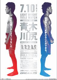
Some initial visual research into print material for MMA organisations and general fight leagues, on the whole I feel the strongest and most interesting are definitely the stuff from Japan, especially Pride FC's posters which I actually really like, the considered layout and use of space is really what sets theirs apart from other fighting organisations. There's already bad perceptions about MMA as "cagefighting" and having these heavy metal style posters really doesn't help, which is why I like Pride's almost peaceful and calming posters, they're not always like this though..


UFC


PRIDE FC

Pride FC made posters which I really like, the concepts are much more subtle and rely less on faces to sell the fights and are much more considered in type and layout, definitely inspiring in terms of visuals.


DREAM


Really cool stuff from Dream too which as an organisation is basically just a second less successful stab at Pride FC in Japan. I love how creative and experimental they can get, especially for what is basically a prizefighting poster.


Read More
Posted in OUGD505 | No comments
Newer Posts Older Posts Home
Subscribe to: Posts (Atom)

Popular Posts

  • TED: Creating Your Logo
    Source:  http://www.ted.com/pages/creating_your_tedx_logo Cool to see what typefaces, spot colours etc organisations use for their logos. //...
  • Graphic Design is Good For Your Health
    Following on from my dissertation and some of the conclusions and aims I applied towards my physical resolution - this article has been real...
  • Foil Blocking & Spot Varnish examples
    I've been looking for examples of different print techniques to see examples of how, for example in this case, foil blocking and spot va...
  • Morihei Ushiba - The Art of Peace
    I've ordered The Art Of Peace by Morihei Ushiba , it's a philosophy book on Bushido and Martial Arts philisophy by a legendary Aiki...
  • Woodblock printing - Notes/Process/Formats
    My notes: Used to print books before movable type Moku hanga technique differs in that it uses water-based inks Water-based inks provide gre...
  • Jessica Svendsen : 100 Days : Müller-Brockmann
    Jessica Svendsen is now a designer at Pentagram, under the tutelage of Michael Beirut. Michael Beirut runs the 100 days workshop where you b...
  • Process : Embossing
    As part of my research into basic definitions of different finishing processes I'm now looking into embossing, how it's done and the...
  • Bushido Quotes
    Here are really interesting Bushido quotes which reflect "The Way Of The Warrior" in martial arts and particularly Samurai culture...
  • Tokyo World Design Conference _ 1960
    Tokyo World Design  Conference                 1960                            As I'm now still keeping a close eye on the development o...
  • List of Illustrations - Practical (Wimbledon) & Pre-Practical Body of Work
    List of Illustrations – Primary Practical (Wimbledon ) Emirates247 {2012) ‘Novak Djokovic Australian Open 2012’ [Image Online] Available at:...

Categories

  • 100 Things
  • Alphabet Soup
  • Collect/Categorise/Communicate
  • Colour Theory
  • Communication Is A Virus
  • Context of practice
  • Cop3
  • Crit Techniques
  • Design For Print
  • Design for Web
  • END OF MODULE EVALUATION
  • Essay notes
  • How To Be A Best Man
  • How To Buy A Diamond Engagement Ring
  • illustrator
  • It's Your Choice
  • Lecture notes
  • Level 05 Essay
  • Level 05 Publication
  • Love/Hate
  • My Red Book
  • OUGD01
  • OUGD401
  • OUGD402
  • OUGD403
  • OUGD404
  • OUGD405
  • OUGD406
  • OUGD501
  • OUGD502
  • OUGD503
  • OUGD504
  • OUGD505
  • OUGD601
  • Personal
  • Photoshop brief
  • Proverb
  • Psychoanalysis
  • Publication
  • Room For Sale Poster
  • Stamp it
  • Study Task 1
  • Study Task 2
  • Study Task 3
  • Study Task 5
  • Task
  • Task 1
  • The Poster Brief
  • THREE
  • Typo-Gateaux
  • Typography
  • What Is A Line

Blog Archive

  • ▼  2014 (21)
    • ▼  March (1)
      • Graphic Design is Good For Your Health
    • ►  January (20)
  • ►  2013 (105)
    • ►  December (8)
    • ►  November (7)
    • ►  October (6)
    • ►  September (30)
    • ►  July (1)
    • ►  June (1)
    • ►  May (13)
    • ►  April (10)
    • ►  March (5)
    • ►  February (20)
    • ►  January (4)
  • ►  2012 (228)
    • ►  December (18)
    • ►  November (41)
    • ►  October (23)
    • ►  September (1)
    • ►  May (38)
    • ►  April (18)
    • ►  March (45)
    • ►  February (23)
    • ►  January (21)
  • ►  2011 (83)
    • ►  December (18)
    • ►  November (37)
    • ►  October (19)
    • ►  September (9)
Powered by Blogger.

About Me

cena
View my complete profile