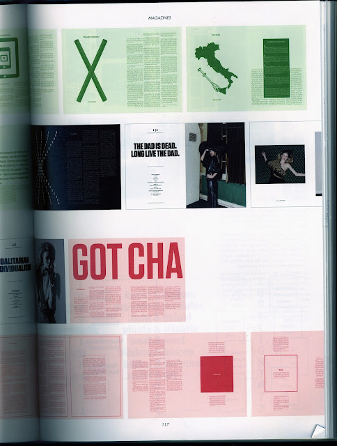
I found a book called 'Page Unlimited: Innovations in layout design' published in 2011 in the library. It is SUCH a good book! Exactly what I was after. I might even consider buying it at the tidy price of £39.99. It's definitely a good investment. Birthday present perhaps? Hope you're reading this mum.
I've scanned in some layouts which I really liked, especially in regards to layout work in Design Principles and as part of my partner layout for PPP.
There's even a cheeky LCA Newsletter making an appearance in here. Colour me impressed.
One of the things I'm going o pay close attention to is the typeface, leading and overall the way they handle the type. This is an area I need to work on and I think something that's been missing from any similar work I've done in the past. It's all the small details isn't it.
Always find myself drawn to the two colour spreads which usually have coloured images, like red hues, green hues, mixed with black type with little sections of it overlapping. Generally just quite loose and easy on the eye. With a grid system but very well hid. I think I'm gonna give a similar style a shot with my layout work.


0 comments:
Post a Comment